
Textual Analysis:
Principal cast:
- Jay Hernandez
- Derek Richardson
- Eythor Gudjonsson
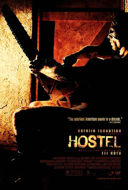
MIS-EN-SCENE
NVC: the poster has a man sitting down facing the light he isn't tensed or screaming in pain which suggests he may be the antagonist as he isn't in pain, he is also sitting down which suggests be isn't running from anything portraying that he is fearless and relaxed.
lighting: the setting is dark, dim and dirty this suggests
lighting: the lighting is dark and dim which suggest that evil is present as evil is always said to bring darkness.
costume: you can't really see what the guy is wearing however you can see that he is wearing a mask which suggests that the mask is his persona and he wishes to hide his identity. this connotes that he may not want people to know who he is giving him power over his victims because when they think they are safe he could be standing right next to them.
props: The main prop in this poster is the chainsaw. This connotes a male gentile which suggest that the person fighting him will have to castrate him to win. The chainsaw also suggest power as he can make people do whatever he wants them to do.
setting: the setting is a small room with a metal door. the metal door suggests the room is able to be locked and is hard to get out which may connotes that the man want to keep someone in that room or wants to keep some out again suggesting he is empowered by this.
Camera: the poster uses a long shot so you can see the whole man this is used because you can see his body language, setting and prop (which is a chainsaw). this makes the audience know how powerful this man is as the way he is sitting is relaxed but stern.
colour: the main colours used in the poster is orange this connotes fire which suggest that something or one is burning. fire also connotes hell which suggest there is evil present in this poster. it can also suggest that the guy is in hell and he may of brought someone there and is inflicting pain and suffering on to a another person. Alot of dark shading is also used creating a shadow this again suggests the presence of evil and danger. it also connotes that the darkness is creeping in and going to take over.
Typography: the typography used has a rustic look to it which suggest it is old a battered. its is also cracked and broken which also suggests that is is old and battered.
mood & styling: the main mood of this poster is, haunting. this is because the man is relaxed and calm but is wearing a mask and carrying a chainsaw. iT SHOWS THIS MAN KNOW HE IS HAS POWER AND IS IN CONTROL OF WHATEVER IS OCCURRING IN FRONT OF HIM.
SPECIFIC CONVENTIONS: ALL conventions are followed. it has the movie title on the right hand corner along with the date line and the actors cridits. It hasn't used any star power in it magazine which is unusual for my film poster but it works as it makes the audience feel the mood of the poster and not the person in the film.
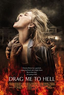
Drag me to hell was released 29th of May 2009 (USA) and directed by Sam Raimi. The sub-genre is a thriller and universal pictures produced the film.
Principle cast:
- Alison Lohman
- Justin Long
- Lorna Raver
- Dileep Rao
- David Paymer
Mise-en-scene:
NVC: On the poster we can see that the female is suffering, this represents her as a weak person which disempowers her already on the poster, giving us an insight of the movie and telling us she’ll also go through pain in the movie. The character looks like she's screaming so it brings in the irrational voice, which once again shows us that she’s seen as a weak person. We cannot see the antagonist, we can only see its hands, it already tells us that the antagonist is not a normal killer, it shows us that there is more to them as his hands a different.
Lighting: The lighting on the character is bright, this suggests the pain she is going through and tells us a bit more about the movie making it look interesting to the viewer, even if they didn't watch the trailer. The light in the background is dark which could suggest that the main characters life stressful after meeting the antagonist, due to the fact that the antagonist looks like she's coming from the darkness in the background.The dark and dim lighting could also connote dark spirits and evil. The use of the brighter light on her suggests she is innocent and is suppressed by the dim light around her.
Setting: The setting in the poster looks like it’s in a neighborhood, somewhere close to home, which creates tension within the audience as they would want to watch it more and know what could happen to them in a situation like that. The setting is dark which makes it scarier for the audience and it would interest them more to watch it. The background of the poster is a street of house like suburban areas in America this connotes safety however the contrast with the fire suggests this peaceful and safe place has been disturbed. Which is further enhanced by the use of dark clouds which suggests darkness and evil is present.
Costume: We see that the character is dressed smart, which relates to the synopsis, as she is a working woman.The Poster places the woman in a pale blue shirt/coat this connotes pace and serenity which contrasts the actual situation. As she is wearing a shirt/coat it suggests she is young but not a teenage more a young adult who wear flannel shirt/coats however the pale blue also connotes youth.
Props: We don’t really see props in the poster, however, we see the necklace getting dragged down and we also the character earrings this shows us the feminine side of the character. On the poster there is flames this connotes and relates to many things, firstly it relates and connotes the film title “drag me to hell” we see that the character is dragged by her necklace into the flames by the antagonist, the flames symbolizes hell and it shows us that the character is being dragged to hell. They tried to make the character look like she’s in the flames which show is that she’s in pain and we’ll be seeing that in the film. Another key element of the flames is the disempowerment of the female identity, which is a common convention in horror movies.
Camera: The camera work used on the poster is a mid-shot of the character. This allows us to see the character clearly and also allows us to identify with her and see what’s happening with her. By the camera being close to her It suggests how she is not free and is captured in this nightmare that she can’t get away from.
Colours: They have mainly used dark colours on the poster, the only bright par is the flames. The dark colours are around the back and on the character; this could connote unhappy and stressful times for the character, they have made the antagonists’ hand dark, which show that the bad times are coming from the antagonist. The flames have some red parts in it which could symbolize blood in the horror genre, this connotes the torture the character will be going through. The clouds are black and grey over the houses, which could connote bad times within the household (Christine and her boyfriend).The background is of houses but they are all grey this connotes darkness which suggests there is evil present which is further enhanced by the use of black which also connotes death which foreshadows the girls’ future. The use of the fiery red and orange suggests hell; as hell is always associated with fire. The red used suggests the presences of the devil which is further implied by the use of black.
Typography: The title is designed to look like a cracked wall, this could be because of the flames as it is placed near them; this shows how powerful the flames are in the movie which once again makes the female character look weak which is a common convention in the horror movie genre. However, the rest of the font is normal and clear (tagline and credits).
Mood & Styling: The main mood in this poster is pain, it shows us that the character is going through severe pain, and it’s affecting her very badly, this is because around her it’s very dark but the flames are very bright which shows the power of them, another thing that shows how powerful the flames are that they’re in front of the female character showing that they’re more important than her.
Specific conventions: The most common convention is the disempowerment of the female identity, this is the most common and popular convention in the horror genre; although sometimes it could be subverted. Another popular convention is that the weapon is always more powerful than the victim for example the flames are represented to be more powerful than the character as she’s behind the flames and she’s getting destroyed by it.
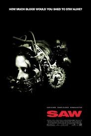
Saw was released on the 1st of October in 2004 and comes under the sub-genre of the splatter horror because it involves a lot of torture and gore. It was directed by James Wan and written by Leigh Whannel. This poster is the first movie in the saw franchise and it then continued on to have 6 other movies to date afterwards, In my opinion I do think the movie did get its idea and adaptations from the 1995 movie Se7en in which similar occurrences and situations happened. The film is about a man named Jigsaw who suffers from cancer, he traps and captures people to teach them lessons in how they should supposedly live their lives, if he doesn't see your lifestyle fit enough or acceptable, he takes life and death into his own hands. Jigsaw gives his prisoners solvable tasks to free themselves but in turn questions there morals and integrity, all tasks have a time limit or death is inevitable for them. The film was produced by three main companies: Evolution Entertainment, Twisted pictures and Saw productions Inc.
Principal cast:
lighting: The horror poster uses as little lighting as possible on the poster and only highlights the woman on the front; the lack of lighting suggests secrets, it is like the mazes and all the tasks to get free are concealed and you have to find the answer, the film saw is also about consequences and repercussions, ‘whatever you do in the dark, always comes to light' this saying is almost literal in the poster showing that all the bad she's supposed to have done is the dark area and now she is now suffering, as we can see with her being highlighted. Another idea is suspense, when you can't see what's happening or you don't know what's going to happen that also creates fear as you are waiting on danger. Dark also represents evil and sin, as hell is usually described as a dark place this poster is majorly covered in black space and this could represent her sin consuming and overwhelming her which is one of the key factors that the culprit, jigsaw seizes to create within his victims. I also feel like they kept it dark to entice the audience, when we see darkness we can't see where it starts or ends (again playing with our minds; which is what saws about) and that effect will make us wonder. It looks like it was intentionally done as it goes with the tag line 'How much blood would you shed to stay alive?' and it makes you wonder if they ever get out.
NVC: The victim on the poster gives the audience eye contact, this makes the audience feel like she is looking directly at us and seeking our help. We can see her eyes are opened very wide, this shows her feeling worried and the shock she was/ is feeling at the time. We can see her mouth is covered and secreted by headgear with tight locks and sharp objects all around it, because the audience can't see all of the item covering her we are now left wondering what it is and what's going to happen to her. She cannot communicate via mouth and we can only her imagine her screams and shouts are going to be muffles which also shows frustration is her eyes, her eyes are the only way to communicate with the audience. The direction her head is placed in shows she is restricted from moving around and she is trapped, we as the audience also see she is desperate and almost calling out for the audience to help her.
setting: We can't see the background of the trapped woman, but that leaves the audience apprehensive about what will happen to her; tension is very common in horror movies and they love to create sudden fear and make you jump, so for us not to know what's around her is probably the main idea and point of the poster. From our own knowledge we already know whereabouts, or more so where she would be, which in turn makes it even scarier as we do have an idea but it’s not confirmed. Horror directors also like confusion, and especially when the audience feels helpless.
Costume: We can only see from her head upwards so her costume is the head wear that she has on. The head wear could also be shown on the poster for ridicule it is very common in splatter movies to be affiliated torture and porn, (also known as GORNO) the head wear gives the impression of quite a sadist and masochistic feel to it. So I feel like they really tried to make the sub-genre known and keep it consistent. The lack of props I feel was also to emphasise that they don't want to give it all away, again common in horror movies as they do want you to watch and find out, they have kept everything minimal and dark to keep it secretive and leave questions in the audience's mind.
camera: It is an extreme close up shot on the cover we only see from her chin upwards, we don't see anything else to keep the suspense. Close ups are really common in horror movies as we get to see the characters facial expressions, they also use reactions shots to show the audience their reaction obviously. Reaction shots are used commonly to let the audience empathise, this extreme close up shows the lady reacting to something as we can see from her eyes, so we now know something shocking has happened and she shows us via eye contact.
colours: The colours they have used for the poster is black, white and red; I feel as they were smart with the colour choice. Red is the colour of blood and fire and represents danger, energy, power, determination and love. All of these associations link in with the plot of saw, people need to battle with love, determination and danger to risk or fight for something. E.g. some people are captured by jigsaw because of the love and addiction for drugs which makes them vulnerable and gives them something to fight and be determined for. It highlight danger that is made known in saw, to place the colour on the front shows that they are warning the audience and letting us know danger is ahead ad that things will also be daring, this works and is applicable as the film is essentially about playing mind and dangerous games with human life, we know that blood will definitely be shed in the movie. It is just highlighted even more to put an emphasis on it. Black is related to dark things and sin, the whole idea of Saw is pretty sadistic and dark, the culprit Jigsaw has taken life and death into his own hands; which means anything can happen- which on that note links in with the colour scheme as we can’t see anything in the dark it does portray to us that anything can actually happen. From the poster it looks like they have used two different fonts, the bolder font is the title/masthead this is done to highlight the name of the film which is very important for advertisement obviously, it is also there to catch the eye of audience by grabbing our attention. It is big and the only red thing on the page so you don’t miss it. The title is directly underneath one of the saw compartments; on the headwear the woman in the poster is wearing, I think it has been purposely placed there to highlight the violence in the movie. The rest of the fonts are smaller and placed in white, to show you those aren’t as important as the title but it is still old to show its importance,(as it is the tag lines, credits etc.). They’ve used a plain font like Arial bold to make it stand out on the page more.
mood & styling: They make the mood of the poster really sinister and it creates a lot of tension, because there is simply no lighting or bright lighting it conveys to the audience that there isn’t going to be any light or good to come out of the situations; and perhaps even saying if they manage to get out they will still be scarred or traumatised as they will have been distressed.
specific conventions: They’ve followed all the conventions of horror posters and movie conventions. They have featured the credits, this could be to attract the audience; most horror movies don’t use really well known actresses like Tom Cruise or Angelina Jolie or if they are featured it is in Thriller. In my opinion I think they don’t use really famous actresses as it taints their names to be in horror especially ones with GORNO. But a little bit of star power is always good like Danny Glover being featured, Danny Glover is very well known as an actor so having someone like him will make people want to watch it more as they know him. So they’ve also used the credits to advertise they’re movie to. The poster uses a quote from the movie as there tagline on the poster. The quote: ‘How much blood would you shed to stay alive?’ This quote is a rhetorical question which creates a train of thought ion the audience mind. This quote was said by Jigsaw using a voice morphing, for the recording of his video to his victims. From this, this makes it clear that the tasks will be agony and excruciating.
Principal cast:
- Leigh Whannels: Adam Faulkner
- Carey Elwes: Dr. Lawrence Gordon
- Danny Glover: Detective Tapp
- Ken Leung: Detective Sing
- Shawnee Smith: Amanda
lighting: The horror poster uses as little lighting as possible on the poster and only highlights the woman on the front; the lack of lighting suggests secrets, it is like the mazes and all the tasks to get free are concealed and you have to find the answer, the film saw is also about consequences and repercussions, ‘whatever you do in the dark, always comes to light' this saying is almost literal in the poster showing that all the bad she's supposed to have done is the dark area and now she is now suffering, as we can see with her being highlighted. Another idea is suspense, when you can't see what's happening or you don't know what's going to happen that also creates fear as you are waiting on danger. Dark also represents evil and sin, as hell is usually described as a dark place this poster is majorly covered in black space and this could represent her sin consuming and overwhelming her which is one of the key factors that the culprit, jigsaw seizes to create within his victims. I also feel like they kept it dark to entice the audience, when we see darkness we can't see where it starts or ends (again playing with our minds; which is what saws about) and that effect will make us wonder. It looks like it was intentionally done as it goes with the tag line 'How much blood would you shed to stay alive?' and it makes you wonder if they ever get out.
NVC: The victim on the poster gives the audience eye contact, this makes the audience feel like she is looking directly at us and seeking our help. We can see her eyes are opened very wide, this shows her feeling worried and the shock she was/ is feeling at the time. We can see her mouth is covered and secreted by headgear with tight locks and sharp objects all around it, because the audience can't see all of the item covering her we are now left wondering what it is and what's going to happen to her. She cannot communicate via mouth and we can only her imagine her screams and shouts are going to be muffles which also shows frustration is her eyes, her eyes are the only way to communicate with the audience. The direction her head is placed in shows she is restricted from moving around and she is trapped, we as the audience also see she is desperate and almost calling out for the audience to help her.
setting: We can't see the background of the trapped woman, but that leaves the audience apprehensive about what will happen to her; tension is very common in horror movies and they love to create sudden fear and make you jump, so for us not to know what's around her is probably the main idea and point of the poster. From our own knowledge we already know whereabouts, or more so where she would be, which in turn makes it even scarier as we do have an idea but it’s not confirmed. Horror directors also like confusion, and especially when the audience feels helpless.
Costume: We can only see from her head upwards so her costume is the head wear that she has on. The head wear could also be shown on the poster for ridicule it is very common in splatter movies to be affiliated torture and porn, (also known as GORNO) the head wear gives the impression of quite a sadist and masochistic feel to it. So I feel like they really tried to make the sub-genre known and keep it consistent. The lack of props I feel was also to emphasise that they don't want to give it all away, again common in horror movies as they do want you to watch and find out, they have kept everything minimal and dark to keep it secretive and leave questions in the audience's mind.
camera: It is an extreme close up shot on the cover we only see from her chin upwards, we don't see anything else to keep the suspense. Close ups are really common in horror movies as we get to see the characters facial expressions, they also use reactions shots to show the audience their reaction obviously. Reaction shots are used commonly to let the audience empathise, this extreme close up shows the lady reacting to something as we can see from her eyes, so we now know something shocking has happened and she shows us via eye contact.
colours: The colours they have used for the poster is black, white and red; I feel as they were smart with the colour choice. Red is the colour of blood and fire and represents danger, energy, power, determination and love. All of these associations link in with the plot of saw, people need to battle with love, determination and danger to risk or fight for something. E.g. some people are captured by jigsaw because of the love and addiction for drugs which makes them vulnerable and gives them something to fight and be determined for. It highlight danger that is made known in saw, to place the colour on the front shows that they are warning the audience and letting us know danger is ahead ad that things will also be daring, this works and is applicable as the film is essentially about playing mind and dangerous games with human life, we know that blood will definitely be shed in the movie. It is just highlighted even more to put an emphasis on it. Black is related to dark things and sin, the whole idea of Saw is pretty sadistic and dark, the culprit Jigsaw has taken life and death into his own hands; which means anything can happen- which on that note links in with the colour scheme as we can’t see anything in the dark it does portray to us that anything can actually happen. From the poster it looks like they have used two different fonts, the bolder font is the title/masthead this is done to highlight the name of the film which is very important for advertisement obviously, it is also there to catch the eye of audience by grabbing our attention. It is big and the only red thing on the page so you don’t miss it. The title is directly underneath one of the saw compartments; on the headwear the woman in the poster is wearing, I think it has been purposely placed there to highlight the violence in the movie. The rest of the fonts are smaller and placed in white, to show you those aren’t as important as the title but it is still old to show its importance,(as it is the tag lines, credits etc.). They’ve used a plain font like Arial bold to make it stand out on the page more.
mood & styling: They make the mood of the poster really sinister and it creates a lot of tension, because there is simply no lighting or bright lighting it conveys to the audience that there isn’t going to be any light or good to come out of the situations; and perhaps even saying if they manage to get out they will still be scarred or traumatised as they will have been distressed.
specific conventions: They’ve followed all the conventions of horror posters and movie conventions. They have featured the credits, this could be to attract the audience; most horror movies don’t use really well known actresses like Tom Cruise or Angelina Jolie or if they are featured it is in Thriller. In my opinion I think they don’t use really famous actresses as it taints their names to be in horror especially ones with GORNO. But a little bit of star power is always good like Danny Glover being featured, Danny Glover is very well known as an actor so having someone like him will make people want to watch it more as they know him. So they’ve also used the credits to advertise they’re movie to. The poster uses a quote from the movie as there tagline on the poster. The quote: ‘How much blood would you shed to stay alive?’ This quote is a rhetorical question which creates a train of thought ion the audience mind. This quote was said by Jigsaw using a voice morphing, for the recording of his video to his victims. From this, this makes it clear that the tasks will be agony and excruciating.
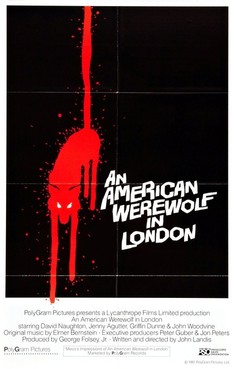
Film title: An American Werewolf in London
Release date: August 21, 1981
Director: John Landis
Sequel: An American Werewolf In Paris
Production Company: PolyGram Filemd Entertainment,
The Guber-Peters Company
Principal cast:
Synopsis: The film starts with two young American men, David Kessler (played by Naughton) and Jack Goodman (played by Dunne), on a back packing holiday in England. Following an awkwardly tense visit to a village pub, the two men venture deep into the moors at night. They are attacked by a werewolf, which results in Jack's death and David being taken to a London hospital. Through apparitions of his dead friend and disturbing dream sequences, David becomes informed that he is a werewolf and will transform at the next full moon.
Colour: In this Poster the colour scheme is very basic but connotes a lot about the horror genre. In this poster the colour scheme is black and has a splash of blood Red drawn into a werewolf. The use of the black not only helps the blood red and white text stand out but is also seen as a foundation in the genre of horror. The colour black connotes evilness and doom which are key characteristics to making horror significant. The use of the blood red also connotes death which signifies that in this movie death or murder will be expected by this werewolf. The juxtaposition of both colours introduce the theme of evil and death which helps give away key themes in the movie and help promote the horror genre in a very simple way.
Font: This Poster uses crooked font to make the poster draw out an element of fear that it’s designed for. The use of this font may connote a sense of historical fear and may reflect on the historical stories and stereotypes associated with horror in the 80’s
Lighting: The lighting in this poster is very low key and minimal but adds to the dark gloomy aspect of horror. The whole poster is dark whilst the image of the werewolf is slightly bright which helps it stand out. This helps signify the primary importance on the poster and connotes a theme of death by the Slasher genre of horror.
Mood & Styling: The overall mood and styling in this poster connotes a theme of painful revenge due to the use of the Red blooded werewolf. this foreshadows that the film will be based on revenge from a were wolf which is a half man half human figure.
Release date: August 21, 1981
Director: John Landis
Sequel: An American Werewolf In Paris
Production Company: PolyGram Filemd Entertainment,
The Guber-Peters Company
Principal cast:
- David Naughton
- Jenny Agutter
- Griffin Dunne
- John Woodvine
- Lila Kaye
- Frank OzJohn
- Landis-David Schofield
- Brian Glover
- Rik Mayall
- Don McKillop
- Paul Kember
- Linzi Drew
Synopsis: The film starts with two young American men, David Kessler (played by Naughton) and Jack Goodman (played by Dunne), on a back packing holiday in England. Following an awkwardly tense visit to a village pub, the two men venture deep into the moors at night. They are attacked by a werewolf, which results in Jack's death and David being taken to a London hospital. Through apparitions of his dead friend and disturbing dream sequences, David becomes informed that he is a werewolf and will transform at the next full moon.
Colour: In this Poster the colour scheme is very basic but connotes a lot about the horror genre. In this poster the colour scheme is black and has a splash of blood Red drawn into a werewolf. The use of the black not only helps the blood red and white text stand out but is also seen as a foundation in the genre of horror. The colour black connotes evilness and doom which are key characteristics to making horror significant. The use of the blood red also connotes death which signifies that in this movie death or murder will be expected by this werewolf. The juxtaposition of both colours introduce the theme of evil and death which helps give away key themes in the movie and help promote the horror genre in a very simple way.
Font: This Poster uses crooked font to make the poster draw out an element of fear that it’s designed for. The use of this font may connote a sense of historical fear and may reflect on the historical stories and stereotypes associated with horror in the 80’s
Lighting: The lighting in this poster is very low key and minimal but adds to the dark gloomy aspect of horror. The whole poster is dark whilst the image of the werewolf is slightly bright which helps it stand out. This helps signify the primary importance on the poster and connotes a theme of death by the Slasher genre of horror.
Mood & Styling: The overall mood and styling in this poster connotes a theme of painful revenge due to the use of the Red blooded werewolf. this foreshadows that the film will be based on revenge from a were wolf which is a half man half human figure.
Magazine Covers
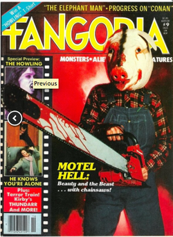
Mise-en-scene:
Lighting: Very bright on all images especially the main image of the antagonist, this shows a clear view of the type of person he is, and shows us that he’s a masked killer which is a common convention in the slasher genre.
NVC: We don’t see much expression on the killers face as he has got a mask on however if we were to analyse his type of mask he does look happy, this could connote that he enjoys what he does and take pleasure from it; especially as he is holding his weapon before him, the weapon represents a phallic symbol. On the left third of the magazine we can see a female character being the victim on the bottom picture and the picture on top looks like a female killer so there is some aspects of subversion, it shows that the female killer is also more powerful as she is above the victim on the magazine.
Setting: We don’t see much of the setting, however, we could assume its suburban warehouse where the killer does his job. It seems like it’s covered by smoke which makes it more interesting as it looks like he’s hiding something. On the left third the last image looks like she’s getting killed in her own her home which once again disempowers the female identity.
Costume: The killers costume looks like he’s a forest worker which connotes that he’s likely to cut a destroy tress; destroys nature, therefore, he kills humans which relates to what he does.
Props: The main prop we see is the killer weapon, the weapon a represented as such a powerful object, firstly it’s seen as a phallic symbol which kills women. However, most importantly the weapon is in front of everything even in front of the killer showing that it’s more powerful than him; the weapon covers some of the female in the left third top image, the blades are around her neck once again showing the female identity as weak and showing how a simple object can be more superior than them.
Camera: They have used a long shot on the main image of the killer, this connotes that he’s big and has authority over all other images. The images of the females are small on the left third which disempowers them. The top image is a close up which helps us identify with the victim and understand what she’s going through.
Colour: The colour scheme a just about the only colour used on the magazine cover is red, the colour red symbolizes blood which relates to pain, torture and death which are key elements in a horror movie. They have used the colour black around the back, this could connote dark time for the victims as the black part is more towards the end and the victims are degraded anyway, just underneath the black is red which could connote blood and mainly death especially as it is at the bottom part of the magazine cover.
Typography: The typography on the poster is simple, they have used a simple font bringing out the key aspects of the magazine (main image of the antagonist). The typography is kept behind the killer showing us that the killer is more important, this connotes that the killer has a lot of power. They have kept consistent colour throughout the typography, a yellow this could connote and relate the killer, as yellow is a bright and happy colour this shows that the killer is happy with what he does.
Mood & Styling: The main mood on the front cover of the magazine is to show the power of the antagonist, especially as they have used a long shot with his weapon in his hand and before him. We can see there is also some pain through the left third images.
Specific conventions: The magazine does carry of the basic conventions such as a masthead, left third, barcode and a selling line; these are all related to the horror genre.
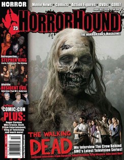
Masthead: The masthead ‘Horror Hound’ is displayed at the top of the page, placed in around the middle area. The font used for the masthead is clear bold and it capital letters, it is not in the typical Arial. Arial font would probably be too safe and boring for a horror magazine as you want it to stand out. The font is all black with an outline of crimson red around all the letters, red connotes blood and pain which is suitable for a horror magazine because those are some conventions of a horror. The name they have given for the magazine is also suitable for the magazine as the word ‘hound’ is thought of to be a dog, mongrel or wild animal of some sort and to place it next to horror will imply and connote that the magazine is full of and all about gore.
Dateline: The dateline is located just above the masthead on the right hand side of the page. It is quite small and miniature in comparison to the rest of the fonts but this would be because it is not as important as the rest of the fonts and text on the page. Although it does give vital information for the consumer like the date the magazine was issues and the pricing. The date is extremely important for consistent magazine readers as it lets the follow and keeps up to date with the issues, which is important especially when you have a fan club; this particular issue was released in September 2010 and is the issue for September and October. The price is also important as it lets the audience know how much they are paying. The smaller the price, the more expensive the magazine is likely to be. If it was a cheap price i.e. $2, it would be plastered against the magazine to show off the bargain. The magazine appears to be quite high end as it is $6.99- almost $7 which translates into roughly £4.30 BPS, this tells the audience the quality should be good.
Main Image: On the issue they have an extremely big main image, in comparison into all the other images on the page. It tells the audience this is the most important thing on the page. The image is of a zombie from the movie ‘the walking dead’ the sub-genre of that movie is zombie horror. The image takes over most of the page letting the audience know the issue will be about zombies; the image supports the conventions of magazine as the zombie is looking directly at the audience, which engages the audience in the magazine and makes them feel like the zombie is looking directly at them. The title of the movie is the second biggest thing on the page, it is bold and red; red as mentions before connotes blood. The image is really unattractive and gory which shows the movie will not be family friendly. ( a good thing in horror movies)
Main Cover -line: The cover line is bold and lies on top of the image, it does not block any main features as it is quite near the bottom, but the colour and font make it hard to miss. Zombies are dead and will obviously not pump blood around which then suggests the title is not signifying their blood and instead others which creates fear within the audience. The cover-line is really straightforward and just keeps it as the title of the film which gets straight to the point.
Cover –lines: All the other cover lines are in red and white to keep it simple. They haven’t had too many different colours and just kept it down to three. This is probably done so it does not take away any attention from the main image and main cover-line. Each cover line sits with an image to go with it; this is to show the audience the magazine is packed with plenty of other juicy and interesting stories.
Barcode: the barcode is located at the bottom left side of the page; it is probably at the bottom of the page to not draw any attention away from any other stories on the page. The barcode suggests the magazine is well known and established enough to be in superstores where they do have scanners etc.
Selling line: For this particular issue the selling line is ‘The horror fans magazine’ using the word ‘the’ cancels out any other horror magazine, implying to the audience it is the best horror magazine about and that all the horror magazines are mediocre.
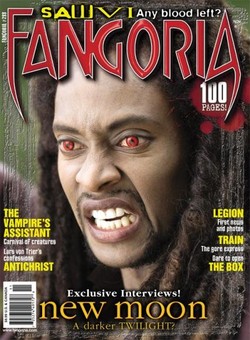
Film title: The Twilight Saga: New moon
Release date: 20 November 2009
Director: Chris Weitz
Film Info: Prequel: Twilight, Sequel: Eclipse, Adapted from: Twilight, New moon
Production Company: Temple Hill Entertainment, Imprint Entertainment, Sunswept Entertainment
Principle cast: Kristen Stewart, Robert Pattinson, Taylor Lautner, Ashley Greene, Rachelle Lefevre, Billy Burke, Peter Facinelli, and Nikki Reed
Mis-en-scene
Synopsis: On her 18th birthday, Bella Swan wakes up from a dream in which she sees herself as an old woman. She expresses her distaste with growing older than her boyfriend Edward Cullen, a vampire who stopped aging physically at 17. Despite her lack of enthusiasm, Edward's adoptive family throws Bella a birthday party. While unwrapping a gift, Bella gets a paper cut, causing Edward's brother, Jasper, to become overwhelmed by the blood's scent and attempt to kill her. Realizing the danger that he and his family pose to Bella, Edward ends their relationship, and the Cullens leave Forks, Washington.
NVC: The NVC of the subject in this image is very strong as it gives us a lot to view on this magazine. The subject looks away from the camera and expresses his gore and angered desire for blood through his grinned teeth and red eyes. This connotes a sense of evil desire and violence through the subjects screwed face which helps promote the horror genre and undertakes some of the characteristics of the horror theme such as: Violence & evilness.
Lighting: The lighting at this stage is quiet bright and this juxtaposes the original theme of darkness and blood in the horror genre.But the use of the bright lighting vividly portrays the twilight and helps the subject stand out. The use of the bright light also connotes a theme of anger as vampires do not like daylight which could suggest why the subject has angered NVC towards the light. The bright lighting also portrays his desire for blood which connotes again the theme of violence which is a key characteristic in the genre of horror.
Camera: The shot size of the subject is a medium close up and this is very significant at presenting detail from the subject’s facial expression. The MCU expresses the subjects’ facial expression. He looks away from the camera with his red eyes and angered gnaw towards what he looks at. The use of this shot helps connote a sense of desire and anger as he intends to focus on what he looks at more than the audience. This helps relate to the horror genre as mainly most antagonist have an intended desire to harm and kill and this is their main focus. They do not get distracted by anything else.
Masthead: The ‘Fangoria’ masthead on the magazine is very effective at portraying the horror genre through a serious of characteristics. The masthead is in blood red and has a white outline to help it stand out from the subject. The use of the word ‘Fangoria’ is adapted from the word fang which is a long sharp hollow tooth which is sometimes venomous. The use of the Fanglike font with Blood red connotes a theme of death and desire which again is very key to the genre of horror. Ergo the sharp fanglike ‘F’ and ‘A’ expresses a theme of pain and this is reinforced by the blood red to portray its painful deathlike symbol. This masthead overall relates to horror so well as it portrays the main characteristics of horror which presents fear, death and pain especially through the use of blood.
Main Image: On this front cover there is only a single image of one of the actors from the Twilight saga: New moon. The image is used in a way to portray the character vividly and help the magazine stand out. The subject makes no eye contact with the audience which can connote a feel of aggression and arrogance towards the audience. The types of mood can build up the tense of the horror genre as the main significance of horror is to feed the audience with fear through different ways such as death, evilness violence, mutilations etc.
Main Coverline: On this magazine the selling line states: ‘SAW VI Any blood left’. This makes reference to the horror movie Saw VI and helps portray and reinforce the horror genre by adding another horror movie title. The use of the statement ‘any blood left’ again connotes a theme of desire for more blood and again reinforces the theme of death in horror as it is a key characteristic.
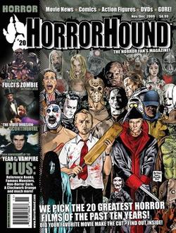
Mis-en-scene
Lighting: the light goes from darker at the top to brighter at the bottom of the magazine this is done to draw attention to the front people as they are the more recent horror films out. This could also suggest the scarier movies are the more recently made movies.
NVC: Some of the people on the magazine have solemn faces which suggests they have endured pain and suffering all their lives which connotes why they are killing and haunting people. Some of the other people are laughing or smiling which suggest they are enjoying the pain they are inflicting. However it could also represent insanity as they don’t understand what is wrong and right suggesting again they enjoy pain and suffering.
Setting: The setting is a dirty grayish green backdrop this is used to make the audience focus on the characters rather than the setting however the dimness of the backdrop still connotes evil and darkness.
Costumes: most of the costumes are red which suggest blood and death. There is also a lot of black in the costumes which represent evil and again death. There is also a lot of browns and greens in the costumes which represents nature and the earth which suggests that evil comes natural to everyone.
Props: Most props used are swords and bats which are long which could signify masculinity which suggests most antagonist are males and the protagonists that are mainly women have to castrate the male.
Camera: A wide angle long shot is used to present as many subjects as possible which represents all the evil and darkness in the world which you can’t get away from. It also suggests that all the evil forces are working together which creates fear for the audience.
Colour: The dark shades used represents shadows and evil which suggest that evil omnipresent and is uncontrollable. The use of a light shade is represents that there is good in all evil and suggests good shines through. The colours green and brown connotes nature and earth which again suggests that evil is natural and everyone has evil within them.
Typography:The typography used is Sans serif it is bold and stands out which is used to draw the attention of the audience to where the edit wants there attention to be.
Mood and styling: The styling is all in cartoon which makes it feel very childlike which takes away the complete horror of the films. They also put it all into cartoon to make it all the same style as each horror film has its own individual l style.
|
Synopsis: Michael Myers is still big, powerful and dangerous. After a failed attempt to reach his baby sister at their old home, Laurie is taken to hospital to be treated by the wounds that had been afflicted by her brother and couple of hours ago. However, it’s not the end for Michael Myers he’ll still be carrying with his famous murdering on a Halloween night until he gets his sister all to himself. Props: There were many props used in the trailer but the most important and the one that’s a common convention was the knife (this was also very popular in the first movie) The knife is seen as a phallic symbol; he’s kills females with that to almost make it look like they’re getting raped; this disempowers the female identity because we see that it has more power than them. Lighting: Throughout the trailer was dark, this tells us more about the story and we see that the main things happen at night which is another common convention in horror movies. The darkness connotes hard and unhappy times, it could also reflect to the killer’s personality and past as we see it throughout the whole trailer. NVC: When we usually watch and horror movie trailer we mainly look for the antagonist because we know that he’ll be the scariest. In the trailer we see Michael Myers on a mirror as his reflection hits it, we see he’s a masked antagonist which doesn’t’ show us any non-verbal communication however, the mask he has on is very serious which builds tension because it shows that he don’t mess around when he’s doing his job which therefore, makes it much more interesting the audience. |
Halloween || Director: Rob Zombie Released: 2009 Production & Financing Company: Dimension Films, Spectacle Entertainment Group and Trancas International. Film Origin: Sequel Principle cast:
|
|
SYNOPSIS:
As five friends pile into an RV bound for a secluded cabin far from civilization, the operators of a mysterious, high-tech control room monitor their every move while preparing an arcane ritual that dates back to the beginning of time. Shortly after arriving, Dana and her friends Curt , Jules, Marty and Holden venture into the basement and discover a little girl's diary from the early 1900s which recounts a series of horrifying events that unfolded precisely where the vacationing teens how stand. Before long, the nightmare comes knocking at the door, murder gleaming from its putrid eyes and a rusty saw clenched in rotting hands. In the control room, everything is going exactly according to plan; Sitterson and Hadley are taking bets, and their supervisor is monitoring every detail. But just when it looks like the show is over, an unexpected glitch threatens to topple the entire system. In the end, Marty and Dana destroy the whole system and with it, the whole world. Genre: Cabin in the woods is mixed between horror and thriller. The first shot of the teaser trailer make it look like a fun and relaxed story line. This helps us get to know the young characters well and already gives us insight on them. Lighting: Throughout the trailer the lighting in the beginning seems quiet bright and up tone which in this sense connotes a sense of relaxation and excitement as these five friends are going together to a cabin to be a way from civilization. After 24 seconds of the trailer the lighting has a drastic change into the the more dark and gloomy look which kick starts the horrific activities in the trailer. This form of lighting is very significant as it helps bring out the horror side of the trailer and helps identify the horror genre as most stereotypical horror trailers are associated with dark gloomy backgrounds and lighting. Camera: There are many establishing shots to help the audience identify the location as the scenery is attractive and beautiful. There are many camera angle changes such as worm’s eye view and bird’s eye view; which is when the camera looking up at the characters when they seem to be in control and the camera looking down when the madness starts. There are many two shots when the actors conversate. This is to get the audience interested in the characters themselves. Post Production: The trailer uses many reaction shots of the characters screaming and displaying fear on their faces and little of what they are actually looking at. This makes the audience want to know what they are reacting to in such way. The trailer is edited with many fast cuts which adds tension and excitement to the trailer. The sound track is made to fit the cuts which adds more power to the trailer and tension to the overall effect. |
Film Title: The Cabin in the Woods
Year of release : 13th April 2012 Director: Drew Goddard Production company: Lionsgate Principle Cast: Kristen Connolly- Dana, Chris Hemsworth- Curt, Anna Hutchison- Jules, Fran Kranz- Marty, Jesse Williams- Holden, Richard Jenkins- Sitterson, Bradley Whitford- Hadley, Brian White- Truman |
|
Synopsis:
Let me in is about a boy aged 12 named Owen who is bullied and is an outcast. He makes friends with another 12 year old girl called Abbey. She only comes out at night in the playground near his house. It turns out she is a vampire. Her Father is a wanted serial killer because he needs to help Abbey survives so kills and drains the blood from the victims. Lighting: The start of the trailer a bright light is used this is to present the Equilibrium which suggests peace and a one upon a time moment. The lighting then goes dark which connotes evil taking over and destroying the happiness which represents the disequilibrium. NVC: In the trailer a girl is scream this suggests pain which makes the audience question what is causing this pain and makes them intrigued. A boy crying is also shown which suggests that is upset about a situation or it could represent fear of something the audience done see which creates mystery. Setting: the setting is a suburban area which connotes peace and security which foreshadows that this peaceful and quiet town is about to be invaded by evil. Costume: The little boy wears a puffy jacket which suggests where he is cold this could represent that evil has taken over and stolen all the heat which symbolises life. The little girl abbey never wears a hat like the little boy which suggests she is not effected by the cold which suggest she could be the that has invaded and is taking the heat causing eternal winter. Camera and editing Many close up are used to represent the characters emotions. They mainly show people crying or in pain which suggests something is causing fear on everyone which connotes evil is present in the town. Quick cuts are used throughout the trailer to show fast pace and movement suggesting that the evil present in the town is fast and unstoppable. Colour A lot of dark shades are used throughout the film to connote shadows which suggests evil has taken all the light away and it taking over. The dark shading is throughout the film and never is never disturbed by a light shade which suggests that no one can stop the evil. Sound A classical score that suggests peacefulness is used at the start to represent the equilibrium and the happiness of the town. A loud non-diegetic bang is used to represent the disturbed peace the disequilibrium which suggests the evil (vampire) is starting to kill and destroy. A diegetic narrative is used to hint at the storyline and what is going to occur in the film. Analysing a Horror trailer:
Insidious was released on the 29th of April 2010, it comes under the subgenre of paranormal/supernatural horror because it involves spirits and outer world objects and things involving the subconscious, like entities. It was directed by James wan who is the same director of Saw. It now has a franchise as they made a sequel: which was Insidious: Chapter 2 and this came out on 13th September 2013, it has been said Insidious got its inspiration from the 1982 film ‘Poltergeist’ as it contains similar ideas and stories in some ways. The film is about a family that have moved into a new house and believe it is haunted as rare and weird occurrences happen; but it is in actual fact one of their sons that fall victim to evil spirits and entities and ends up in a coma, this is because he cannot find his way back from his dreams and in turn he becomes ‘trapped’ in a dark world. The family go through lengths to get there son back and as he returns someone from the other world also returns with him. It was produced by: Alliance Films, IM Global and Haunted Movies. Principle cast: Patrick Wilson: Josh Lambert Rose Byrne: Renai Lambert Ty Simpkins: Dalton Lambert Lin Shaye: Elise Rainer Leigh Whannel: Specs Angus Sampson: Tucker |
Film Title: Let me in
Release date: in UK November 2010 Director: Matt Reeves Production/financing Company: Principle cast: Kodi Smit-Mcphee as Owen Chloe Grace Moretz as Abbey Richard Jenkins as the Father Sub-genre: Thriller/ supernatural (Vampire) |
|
|
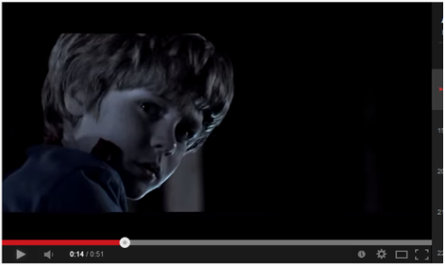
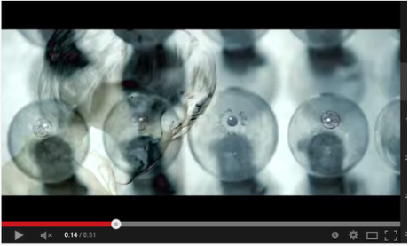
The Trailer uses a mixture of dark and light lighting To catch the audience attention and make us jump. It goes quickly from dark scenes to bursts of light really quickly. For example 0.14-0.14 seconds also.
Insidious highlights things in the movie like the underworld, dark world and subconscious, so I think them using lots of dark light really helps to emphasise that we don’t know what’s out there and there is a lot of suspense as it’s not right in front of us. Dark colours like black also represents concealment and secrets and perhaps whatever’s in that world should not be revealed due to how sinister it is. They also use the colour grey to show the audience that their son isn’t getting better. I also think it is to show how far he has slipped under into the other world. Grey is very much near the colour black in terms of shade and I believed they used that as a scale to show when he would be completely gone. As it is a trailer there is of course dialogue and digetic sound but they have made use of body movements and facial expressions to non-verbally communicate with the audience.
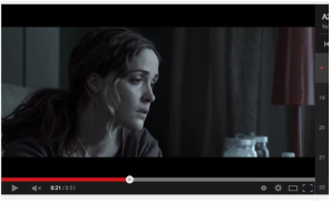
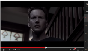
The normal connotation of a woman is that she is well kept and presentable; especially as a stay at home mother or housewife. We can see how much stress and worry she’s under by the scruffiness and unkempt hair, she also is not wearing any makeup, from this we can see a lot of bags; which shows the audience she has been having sleepless nights, Her eyes are drooping also so it’s obvious she’s tired but refuses to rest as she is worried about the health and safety of her son. The audience can tell her first priority is her son, and not herself, this connotes she will always put her son first and if push comes to shove fight for her son in anyway.
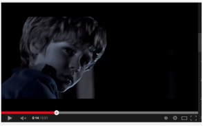
The son plays a key part in the movie and we can tell by his facial expressions that he has seen something that scares or alerts him. He is looking back over his shoulder and his eyes are widened as if he has seen something so shocking this shows the audience he is in fear of whatever he sees, which is obviously the main connotation of horror.
Here we see his lips parted almost as if he can’t believe what he’s seeing it also shows confusion because he doesn't know what’s just happened or how it’s happened; this is a popular connotation of psychological/ supernatural horror as things happen that will shock and scare you as they can do things and scar you. His eyes are also squinted, squinting your eyes could mean you’re thinking about something, again this is a popular connotation as it shows he’s confused about what he’s just seen and is trying to work out how it’s happened. You can also see by his body language that he is at an angle, this shows his apprehensive behaviour to go and find out what’s happened or what it is that has done this strange thing. He is preparing himself to get hurt by not throwing himself fully at the danger.
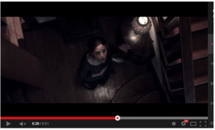
Whatever she has just heard we can see by her hands and her facial expression that she is extremely shocked and scared by what she has heard. Her eyebrows are raised very far upwards and her mouth is shaped in an ‘o’ – this could mean she was mouthing ‘Oh my gosh/God’ or extending her mouth as if she can’t believe what it is she’s just heard; as well as being raised she is frowning as if she is in anguish, this shows signs of her worrying. We can see her eyes are widened conveying she is very alert by the news she has just heard, her hand movements also support this point as she is clutching onto her stomach because she can’t believe it. The camera shows her left hand in the air like she has just dropped something, whatever she has heard has frightened and shocked her so much she had let go of the grip she had before.
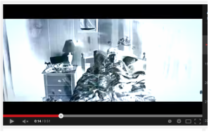
They have used quick cuts to show some of the settings in the trailer, here they have shown us a child’s bedroom using a wide shot to show the audience everything in the setting. Insidious falls under the psychological/supernatural sub-genre of horror and the purpose of these movies are to mostly frighten you by playing mind games and scaring there audience also. So by using this wide shot to show everything in the setting and editing it in a quick cut style, is the make the audience wonder if they actually saw it or if we thought we saw it
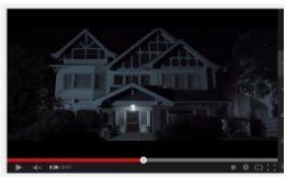
Here is an establishing shot to show the audience where they are or will be in the movie. Most people remember mental images of things so placing this house here is to scare us as we know it would have some relevance as to why we should be scared. There is one light at the front of house, this connotes the ‘house’ inviting you in with the light showing the way but the rest of the house looks uninviting and dark so it seems as if it is a lure. The light on at the front of the house is very sinister as it is a warning light, the light at the front of the house should only come on if someone is standing outside as it alerts residents. From the print screen we can see no one is there implying there is a ghost or entity which would explain the light and no one being there.
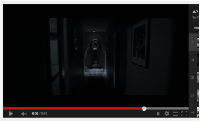
They used a Steadicam in this shot, they went from 0.35-0.41 seconds to sow this hallway. With each second the camera moved forward and the scene was lit, it went from pitch black to visible to the eye. Doing this they used long take with a slow pace to show importance they also did this to create suspense within the audience as it builds tension and we don’t know what happens next, the audience will keep watching in case something happens
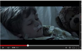
The directors used a close up to show us his pajamas. He is wearing children’s pajamas which is obviously age appropriate considering his age which is around 7-10 years old. This subverts the stereotype as we don’t expect a child to be involved in anything to do with horror or evil- especially a psychological/supernatural themed one as children are seen as innocent so using a child makes it more fearful as it means even someone so young can be involved in perhaps evil behaviour. I feel they use children to show the audience as well that if the helpless and weak can be targeted then so can anyone as children are meant to signify purity and innocence so it puts more fear in the audience as it show’s no one’s safe.
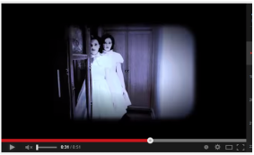
Here they have used two young girls. They have used a wide shot to show their outfits and everything in the scene. Using a wide shot prohibits the audience from seeing their feet showing we are pretty or somewhat close to them; we can see they are backed up near enough to the closet to show how far back the camera is, this is scary as we don’t know the two girls but assume they are dead from the black and white faces and lighting. They have made the white on the dresses and the lighter areas of the scene amplified to draw more attention to it. The black and white suggests they are dead from a long time ago. It is a convention in horror movies that entities or ghost are usually or majority of the time shown in black and white, so by amplifying the colours draw a lot of attention to the fact they are conveying death. They also used quick cuts for this to again play mind games with the audience and makes us wonder if we actually ever saw it, the cut from scene to scene is so quick that it appears on the screen for less than one second. The costumes they have used favour dresses from the 1800’s, this shows that they have probably died because no one walks around wearing dresses from the 1800’s in the noughties era; so it is like they are trying to connote death by just showing the two girls staring.
They have also used props like face and gas masks, gas masks are very common in this sub-genre as the helper(prop theory- in this case Elise (to the left)) always tries to get rid of the evil spirit or entity by calling to them, the reason why is unclear but it is always used and is an iconic prop.
They have used white capitals in semi bold letters, this stands out to the audience as they have used all neutrals colours, however the white against the black makes it stand out; and grabs the attention of the audience as it is striking. They haven’t used the standard Arial font that most posters, trailers etc use; instead they’ve used a different type which has subverted from the stereotype and they have used a font favouring ‘dotum’. This tells the audience that the movie will be different and unique.
For the colours they have used for the trailer have been mixtures of dark and light neutrals, for example blacks, whites and greys and dark greens. This focuses more of the audience’s attention on the sequence being shown rather than bombarding them with bright colours; but the dark colours also highlight the films situation is serious and frightening as it shows there is no good (the light, vibrant colours) to come out of it and gives the film sort of a sinister dark mood set or feeling. They don’t use continuity editing, this is a convention as they wouldn’t want to give away everything in the movie if they use continuity editing also its a trailer so there wouldn’t be enough space or time to make a trailer that makes sense using continuity editing. They have used a montage of different flicks and parts of the movie, e.g. they would put a normal conversation scene and the quick cut and place a demon or entity in the next scene but by placing them together creates the fear as they are juxtaposed next to each other. The whole general pace of the movie is quite fast, scenes come and go very quickly and you could have to cuts of a scene in one second. I think the whole point of this is to reiterate to the audience the urgency in their problems and things need to happen fast.
The narrative they used is in correlation with the subgenre, the subgenre is supernatural and psychological. The issues they are focusing on like the sub conscious world and evil entities trying to cross over into the normal human world are all common conventions of this sub genre. The way they’ve portrayed it on the trailer is also clear to the audience as they’ve used important and relevant clips to make it obvious.
Throughout the movie they've used non digetic sound, like score. The score they've chosen to put on insidious really creates fear in the audience as it carries on consistently throughout the whole 52 seconds whilst going lower and higher in volume in particular flicks. The score sets the mood of things and the soundtrack they chose fit well as it was like a weird wind noise that was getting rougher, softer, slower ect during different things. The score almost sounds like the blowing noises entities would make which made it scarier, especially for those who watch scary movies from the supernatural genre because it would be familiar to them. Foley is also used for things like doors creaking and footsteps on the floor; Foley exaggerates normal sounds and creates tension, this is done to draw attention to things that weren't noticeable before as they want you to notice it and acknowledge it.
There was no voice over as voice over is usually present in movies like action or thrillers rather from this genre and if they were to use a voice over it would be subverting from the convention. Although, they have used the digetic sound of dialogue, between characters, they have used it in the same way that voice overs would have been used.

