Drafting
Drafting is a key element in our project as it maps out the potential ideas for our trailer, magazine and poster. The real media text helps us and gives us inspiration on our pieces.
Real Media Text For Magazines:
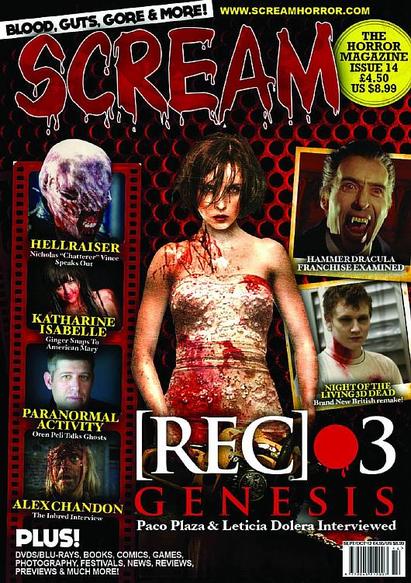
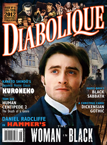
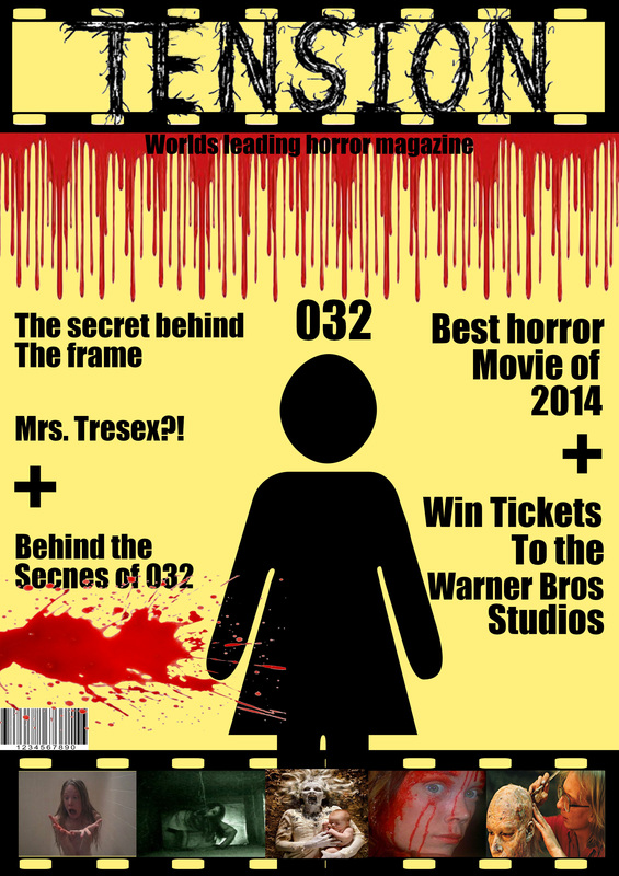
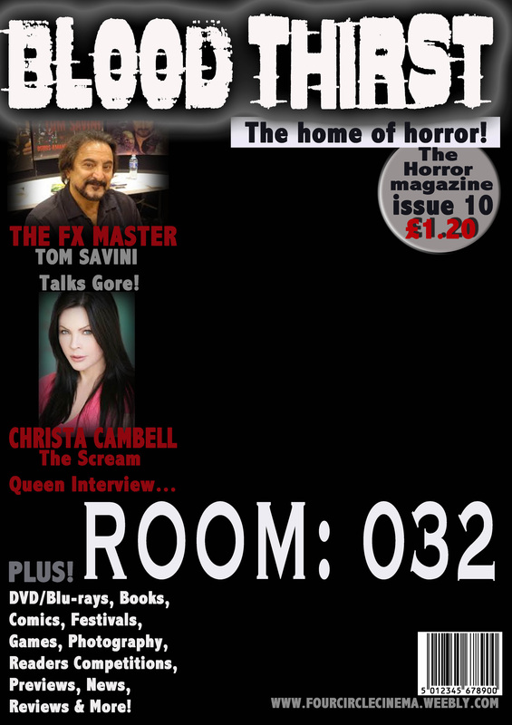
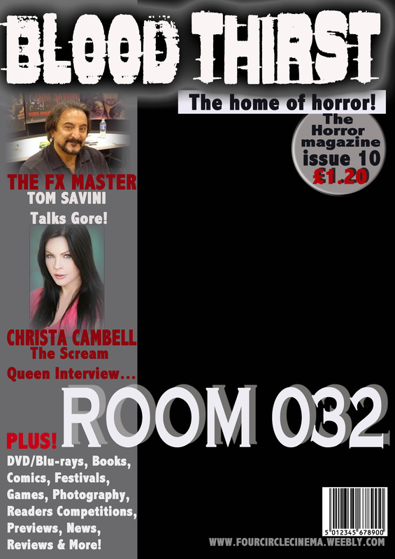
I like this horror magazine because of the layout and the simplicity. It has many images however, it has a consistent flow and doesn't look messy; I also like the way that the images relate to the main image, this could be because the sub-genres are similar. The left third is very successful because it doesn't start from the top leaving space for the masthead which prevents it from looking squashed. I also like the way that the main image covers the 2 on the right side which shows that the film and the character is more important, however, because she's a female the text is in front of her which doesn't give all the power she believes she had; this shows that the horror conventions are followed throughout the magazine.
|
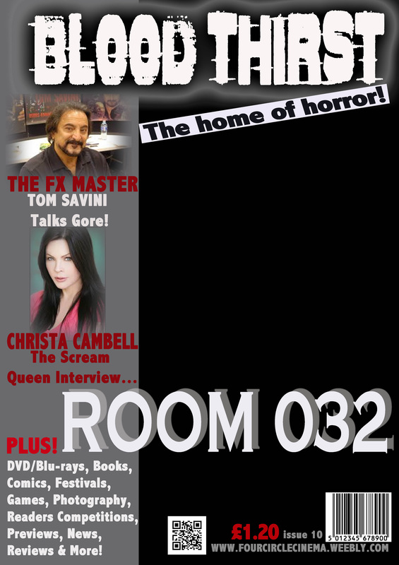
Firstly, I really like the layout of the magazine especially the way they have presented the cover lines onto one side. I Like the way they used animated characters for the main image and shows authority within the image such as, having the female character towards the bottom of the magazine and having the male antagonist above her and in front of the masthead, this shows that the main conventions from the horror genre is followed. I like the way they have limited images, which is important with a very affective main image as it doesn't over power it. I like the layout of the left third and the film strip, the film strip is very common in horror magazines; this could also be a convention for the magazine.
|
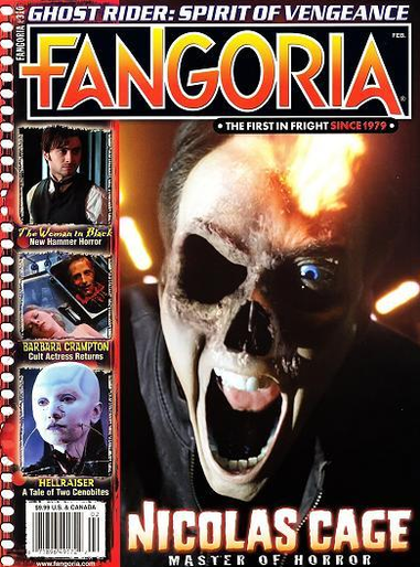
I like the way they have created the masthead as it suites the magazine, especially with the colour schemes. I also like the way they have limited themselves with the use of images, this is important when you have an affective main image such as this magazine. I like the simplicity of the magazine and it like the way they haven't placed cover lines over the main image and they just have text around and the left third. I also like the way they have the name of the film star on the magazine and the fact they have written "Master of horror".
|
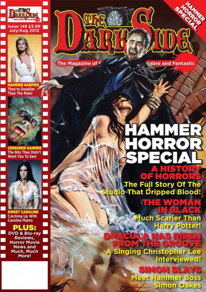
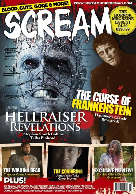
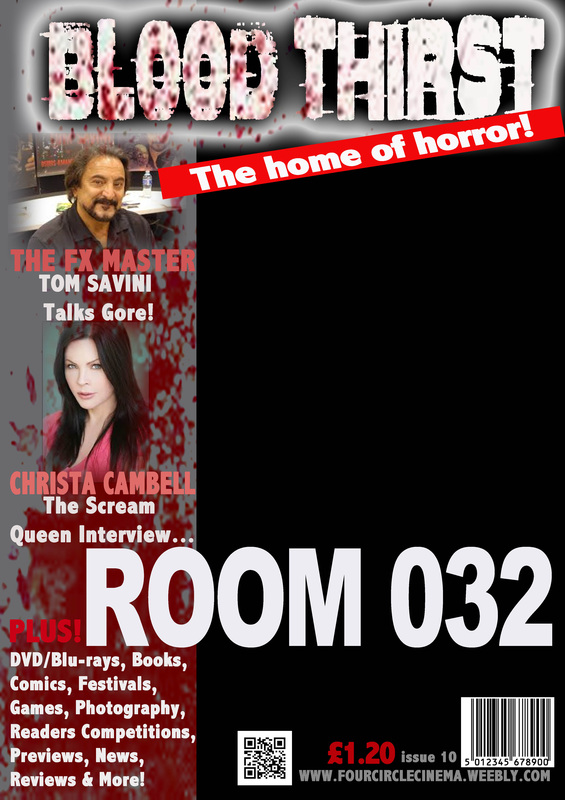
This magazine is different from the main horror magazine however, follows most of the conventions. Firstly, I like the way they have placed images of antagonists and horror related characters across the top of the masthead. this makes the masthead more affective and stylish. I also think the way they have presented the issue number is very successful. I like the fact that the main image is simple and suites the flow of the magazine. I also like the fact that the cover lines don't cover the characters face and make it look messy. I like they way they have added the background and a blur of the antagonist.
|
|
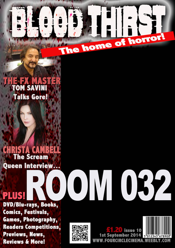
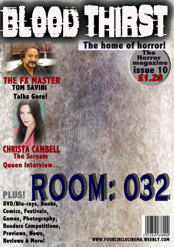
Firstly, I like they way they have placed the images around the poster, I mainly like the one towards the bottom of the magazine. I think having limited cover lines have been successful because it doesn't go over any images. They have used the bottom part of the magazine almost like a left third which shows that some aspects of the conventions were followed. The main image has worked very well with a close-up. I also like the blood splatters on top and at the bottom part of the magazine, it supports the images with the horror look.
|
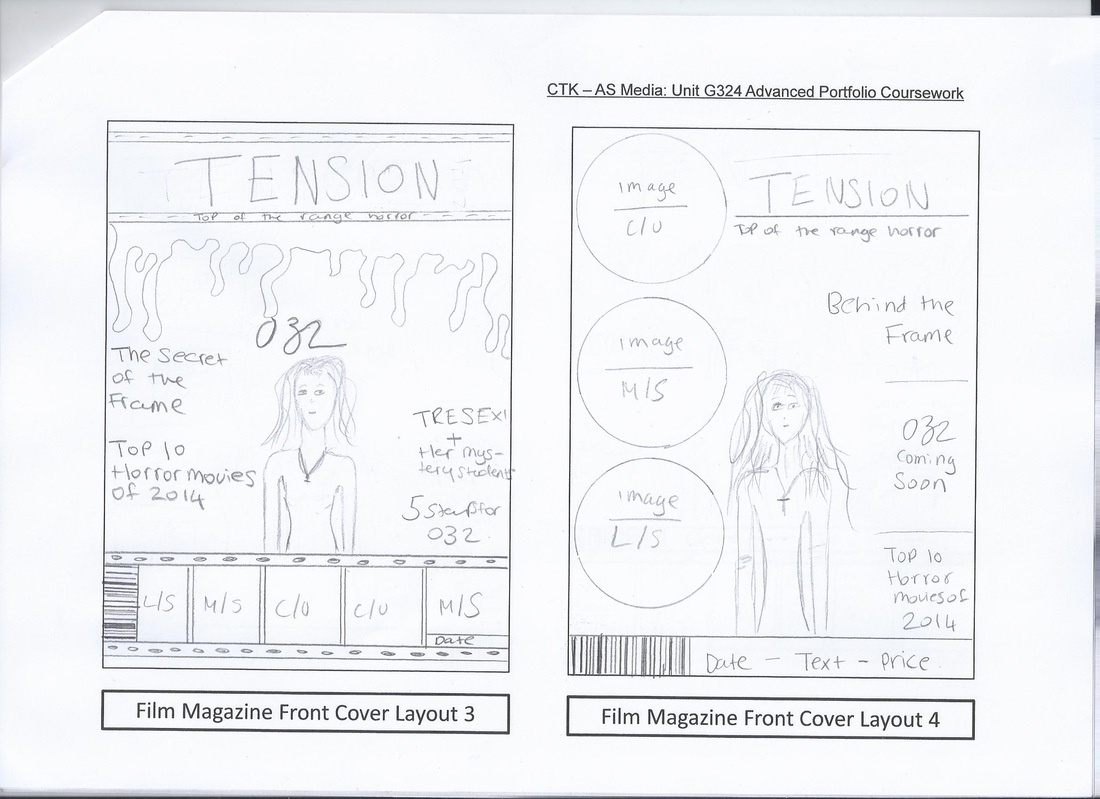
Drawn Drafts - Magazine:
Real Media Text For Posters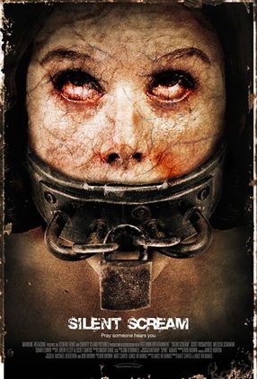
I really like the simplicity of the poster and how it relates to it's title 'silent scream' the character NVC looks like she's screaming however, her voice is blocked off, we see this by the padlock around her mouth; this straight away disempowers the female identity which a common convention in the horror genre. I like the way the film title and tagline is left at the bottom of the poster it adds to the simplicity. Credits are also at the bottom, credits are crucial for every movie poster. I like the idea of having a thin frame around the poster as it makes the victim look like she's trapped and even a frame has more power than her.
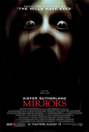
I like the way they have created the title and how everything relates to each other, the letter R is symmetrical with relates to the title 'mirror'. I also like the way they blended the character into the darkness, it shows that they don't really care about her which makes her look weak to the audience. I really like the close up main image they used as we can see the main images nvc, her mouth is covered by the dark lighting and we can see her expression by her eyes. This is really good as it looks like she is looking directly at you. Lastly I like all of the credits shown as it lets the audience know who was involved like popular and 'famous' directors and distributors.
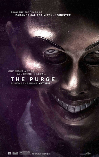
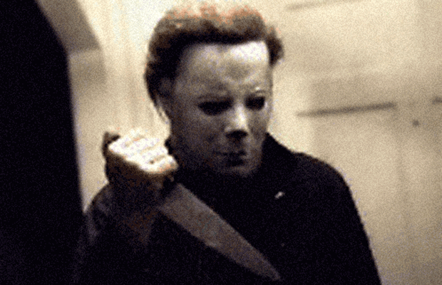
For this poster I really like the main image, the direct eye contact from the image to the audience is really scary as we cant avoid him looking directly at us . I like how the poster is really simple and it doesn't have a lot of text and information on it so we can really focus on the important things, like the main image and the tagline. The tagline rests on some of the main image also to highlight it, it sort of tells you the story whilst making us feel uneasy by the context of it. All credits at the end are minimal and short which I also like. Lastly I really like the realism of the mask they have used, the mask works really well as they have clearly tried to find a mask that looks similar to a real face or at least resembles one, also I do like how they have loosely fitted the mask on the face as it reminds you there is someone behind the mask and its almost terrifying as we can't identify whose behind the mask.
Drawn Drafts - Poster: |

I like the way they have placed the title mid way of the poster with shadows coming down from the letters, they made it look like blood is dripping. I really like the idea of the character smudging the blood across the wall and creating a face from the blood, this is very affective and it's unique as it's almost showing the antagonist and the victim together on a poster. I like the affect of the wall, it's meant to look like it's in a home because of the floors however, they have added a cracked affect on the wall which shows some aspects of the disequilibrium. Credits are placed at the bottom as usual, they have followed the convention.
|

Digital Drafts For Magazines: |
|
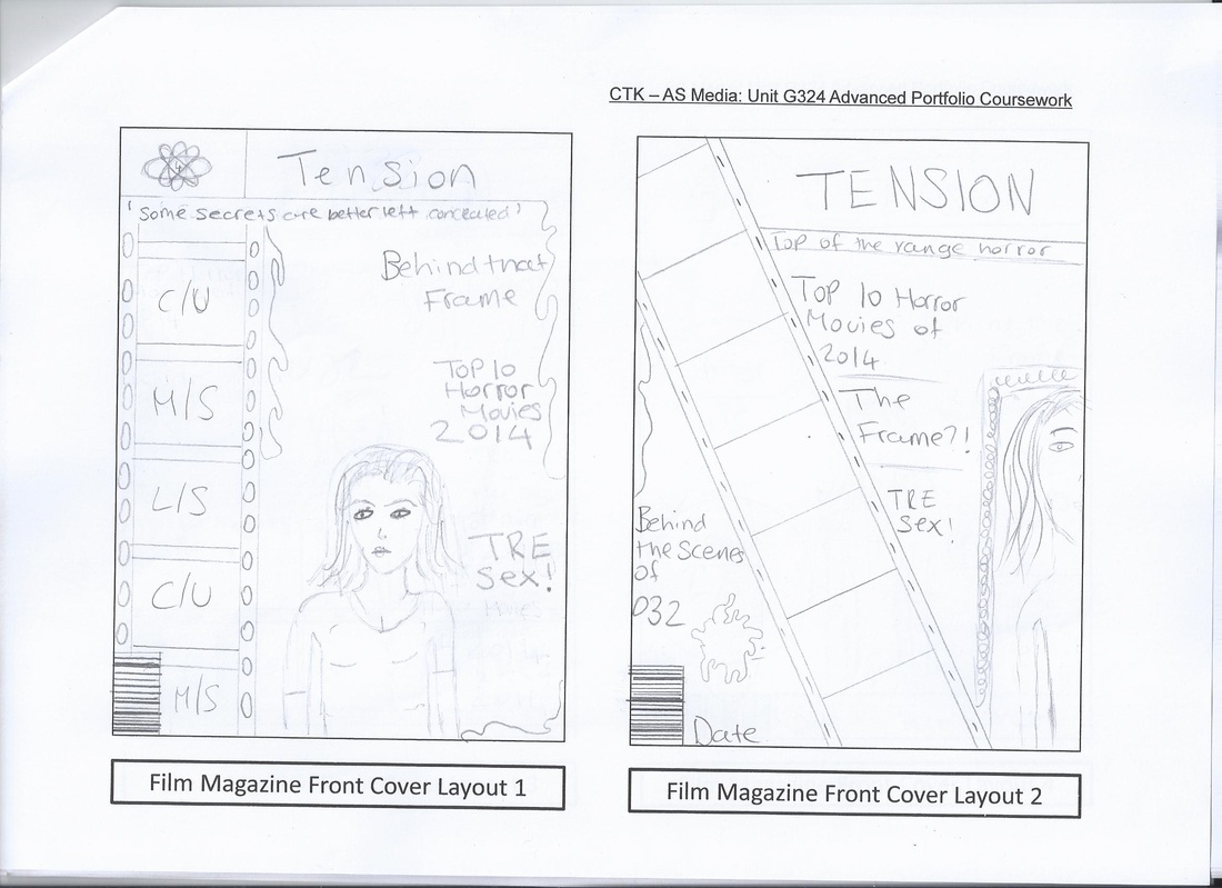
This is one of my basic design ideas for our popular option magazine layout 1; this draft shows where everything will be placed and what parts will have certain stuff.
This draft is also based on magazine layout 2, however this is more complex, it shows the way the model will be positioned and has more detail such as the frame and the blood dripping on the left side of the page.
Digital Drafts For Posters: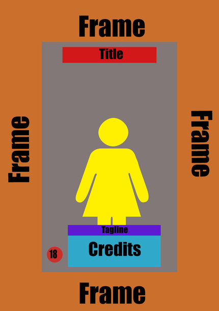
This was a basic draft of poster layout 1, it was quite popular within the group because it relates to movie especially with the frame, this draft shows how the model, tagline and credits will be positioned on the poster.
|
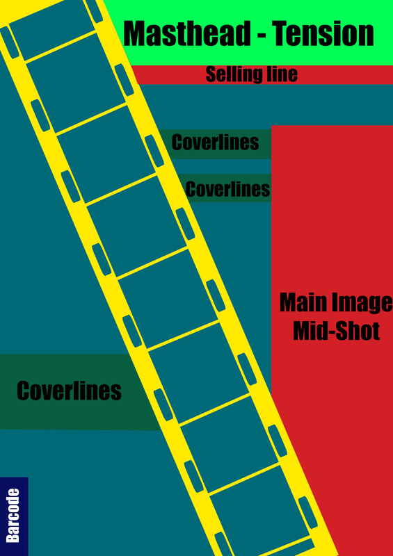
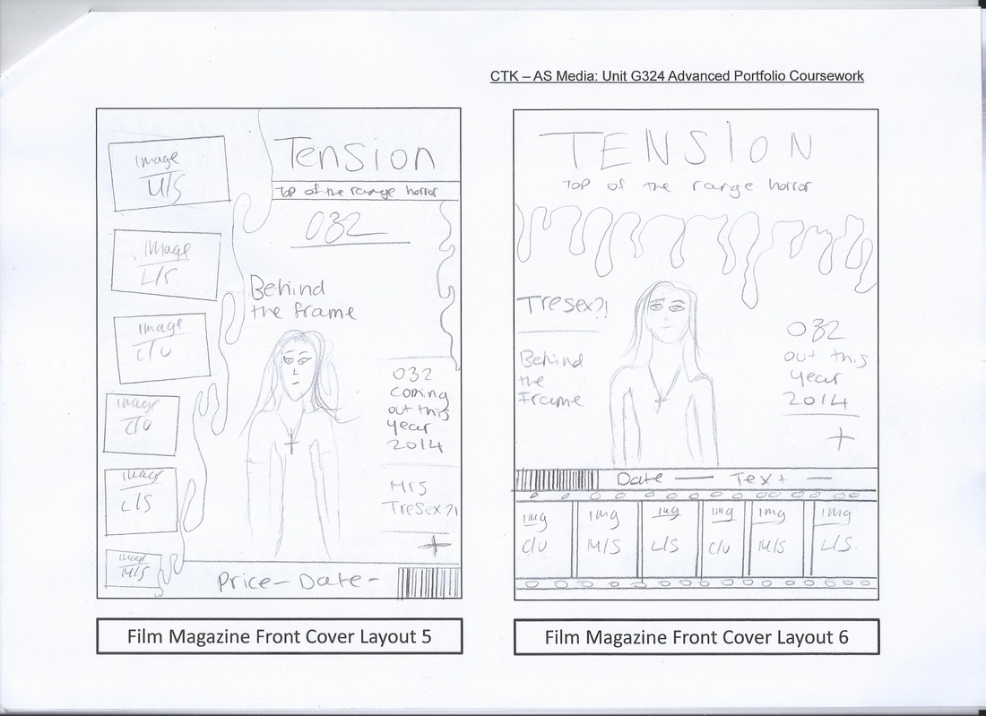
This is another basic design based on another popular option in the group magazine layout 2, it was popular because of the film strip going down the page, this layout shows where certain things will go.
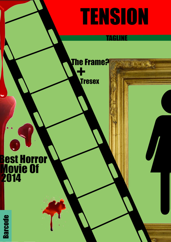
This layout was one of the most popular ideas within the group, this design is the most complex as it has the most details including the potential cover lines, barcode and the blood splatters.
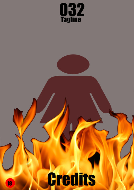
This draft is based on poster layout 2, it's a little more complex than the first one because of the flames I added, however, it's still basic; this is mainly because we want our poster to be simple.
|
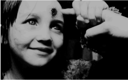
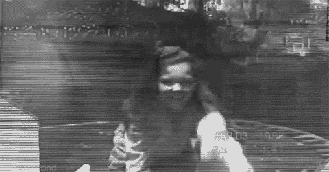
Test Shoot:
The test shoot was designed to give us an idea of shots we can use for our magazine and poster, we also practiced on the NVC of the models. We tried have both characters in our shoot, Mrs Tresex and Jordan.
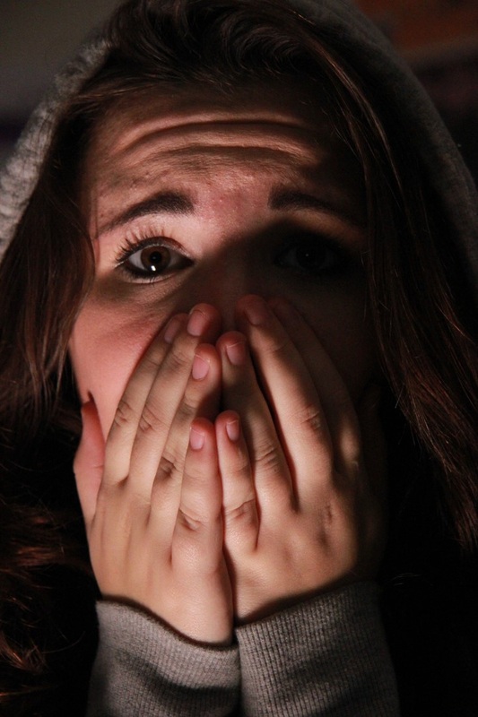
I like this image in many ways, mainly the NVC and the lighting; it shows the fear of the victim and makes the female character look weak especially as she has covered her mouth it makes her look like she has no voice. I like the lighting as it covers parts of her face which shows that she's not really needed. Overall, this image mainly disempowers the female identity which is common convention in the horror genre.
|
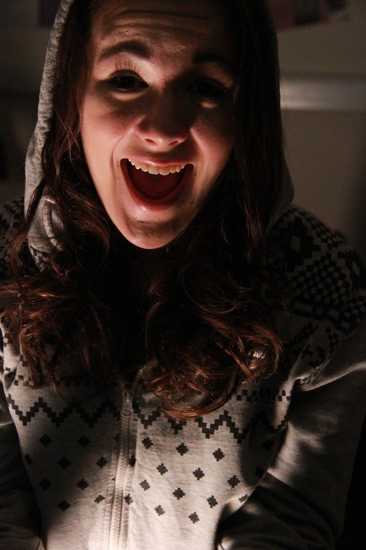
This image is of Jordan, one of the main character in our movie. This image represents the horror genre very well because of her NVC, it looks like she's shouting which suggests pain; something crucial in the horror genre. I also like the way the lighting has covered some parts of her face such as her eyes, this makes her look weak because it shows that she's not important, we could consider an image similar to this to use on our outcomes.
|
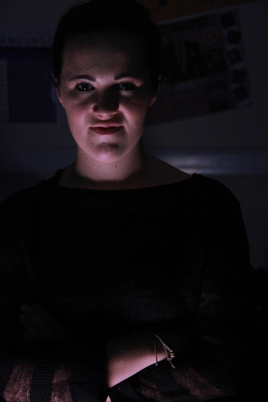
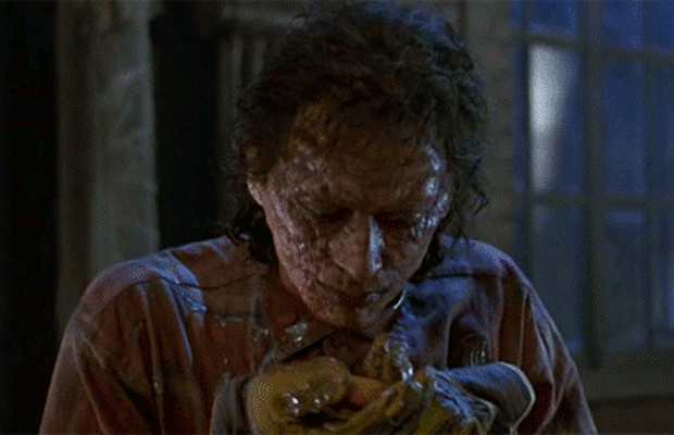
This image is of Mrs Tresex, the NVC is one that we would like to use in the trailer and our other outcomes, I like the way the light is mainly on her face, this shows her importance and shows that she is superior. We used a mid-shot however, there is a slight low angle to make it look like she's looking down on people. The antagonist always looks more powerful in horror movies, this is a common convention.Her NVC looks like she's smirking and is ready to kill which relates to the horror genre.
|
Poster & Magazine Photo Shoot:
|
|
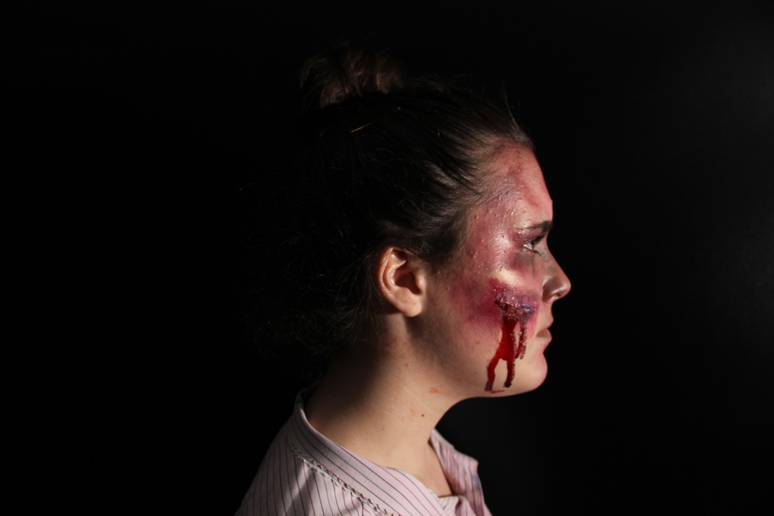
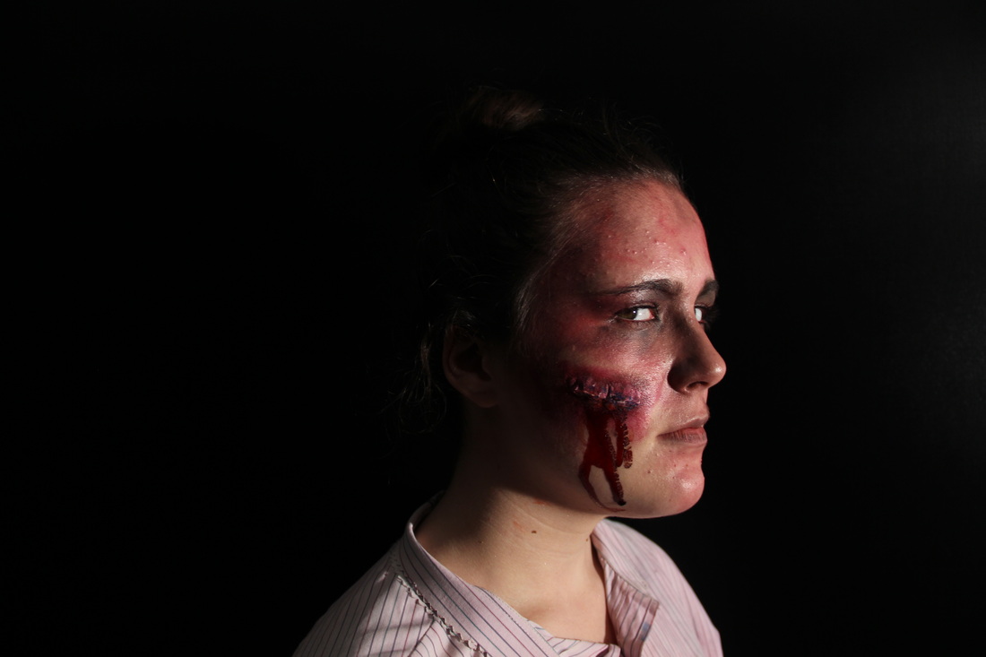
These were some of the images taken during the day of our shooting, the main purpose of these images are how well the make up has been done for the day and for it to give us ideas for our final outcome for the magazine and poster, these will be some of the shots and angles we'll be using for our outcomes.
Poster drafts:
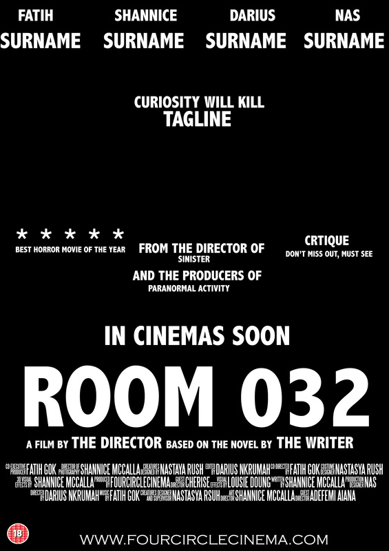
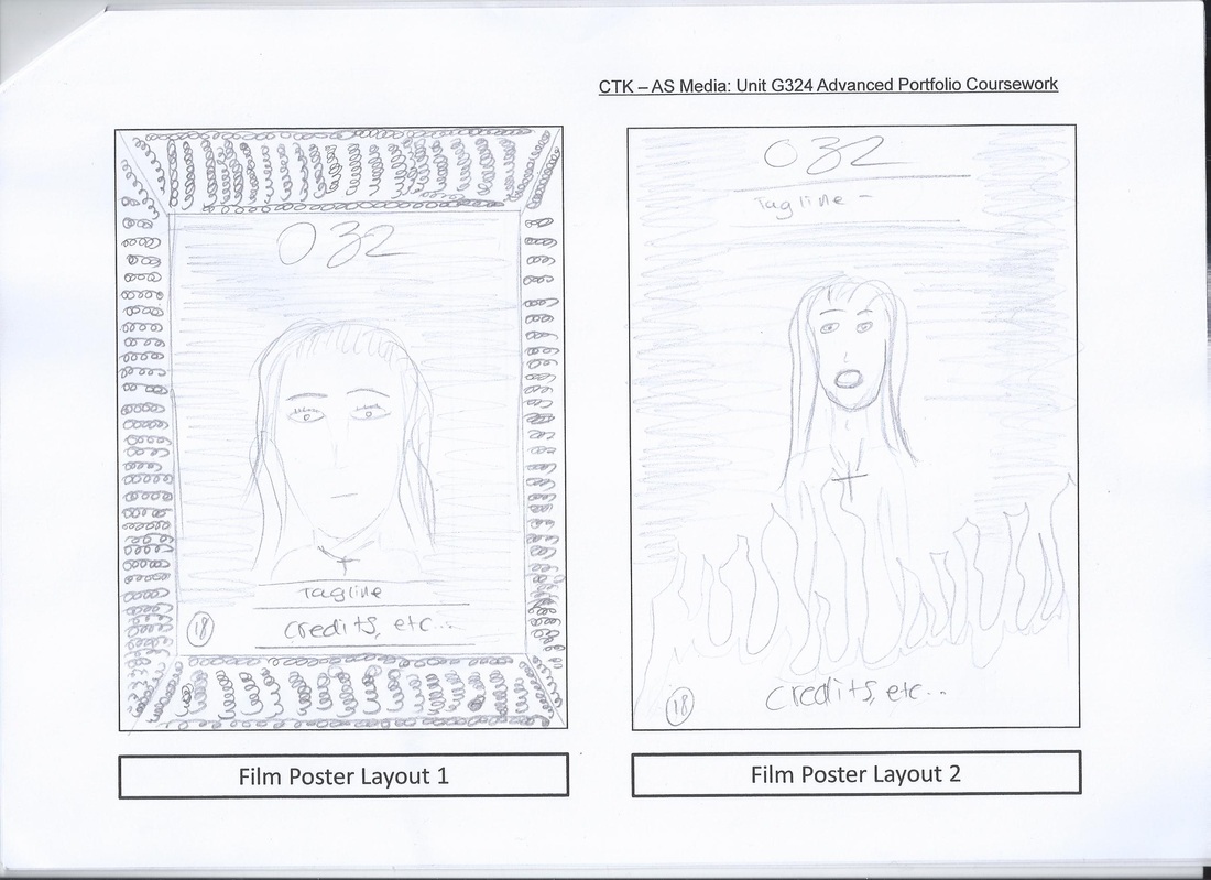
Draft 1: this draft is for our poster draft for our movie room 032. This draft carries out the main conventions that's followed in horror movie posters for example the credits, critique, and the director the film was directed by. by making this draft is has given us a clear view of what our magazine may look like.
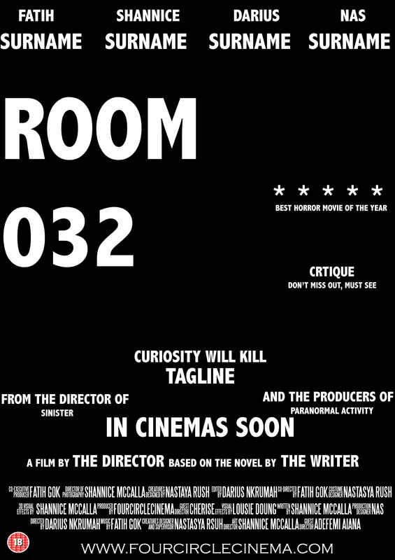
Draft 3: this draft is for our poster draft for our movie room 032. For this draft i got rid of some of the conventions such as the names being on top of the poster, these can be placed in another section maybe towards the bottom of the poster. for this poster we have the common convention of the title being on top of the page and the tagline just beneath it, placing the text like this has once again given us enough space to play around and place the image we're going to use of our antagonist.
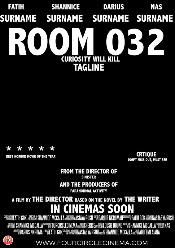
Draft 5: this draft is for our poster draft for our movie room 032. On this draft the title is aligned to the left part of the page, this gives it unique look, however it does look like there is too much going on in poster which may be too much to look at for the user. for all of the drafts i have placed the credits at the bottom of the page because it doesn't suite anywhere else because it just becomes too overwhelming.
|
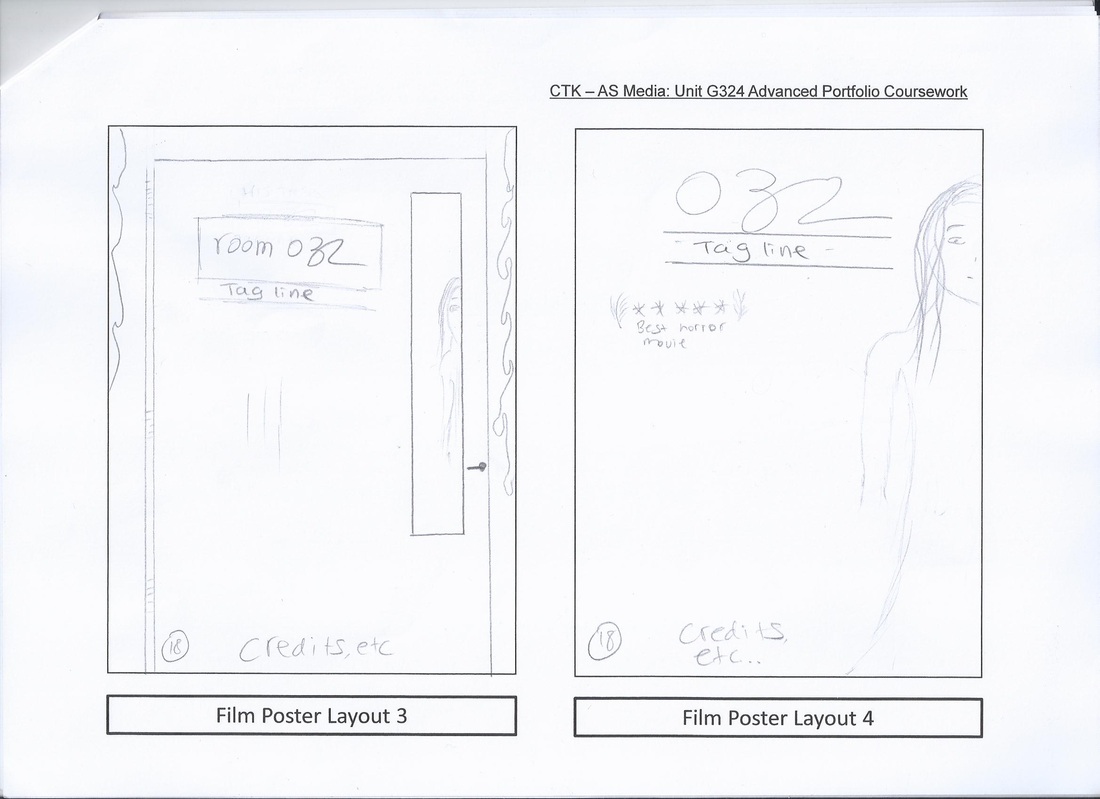
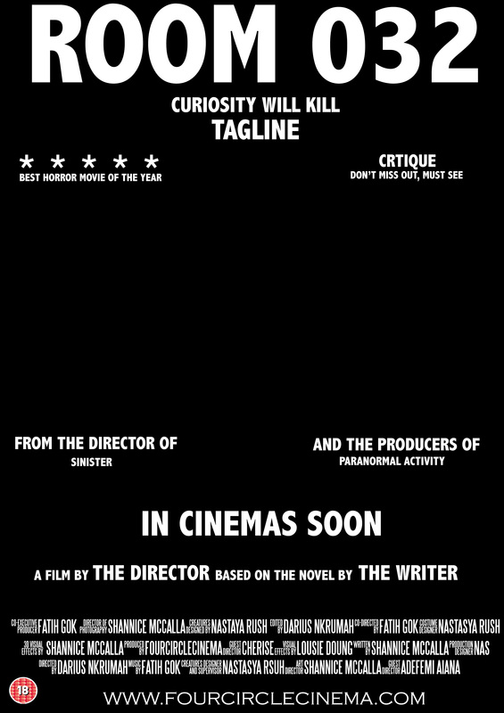
Draft 2: this draft is for our poster draft for our movie room 032. This draft carries out the main conventions, in this draft i have tried to keep enough room for the image, even though our image may be a bit faded i believe we still need a focal point and clear section to place our image of the antagonist.
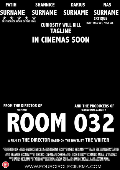
Draft 4: this draft is for our poster draft for our movie room 032. This poster follows the common conventions of a horror movie poster, however, on this draft it is evident that the text will go over the image, this is fine because some horror posters have text going over them,; this would also help because it will be hiding the identity of our antagonist and won't be giving too much away about the film which could be more interesting to the audience. Another convention followed on this poster is having a web address at the bottom of the poster. 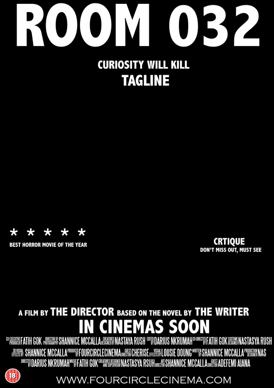
Draft 6: this draft is for our poster draft for our movie room 032. The draft is one of the main ones because of the simple layout, it follows all the conventions and gives a clear section to place the image, for it not to look too plain i added text that will go over the image such as the critique. the only thing missing on this poster and that we won't have space for it the names that go on top of the poster.
|
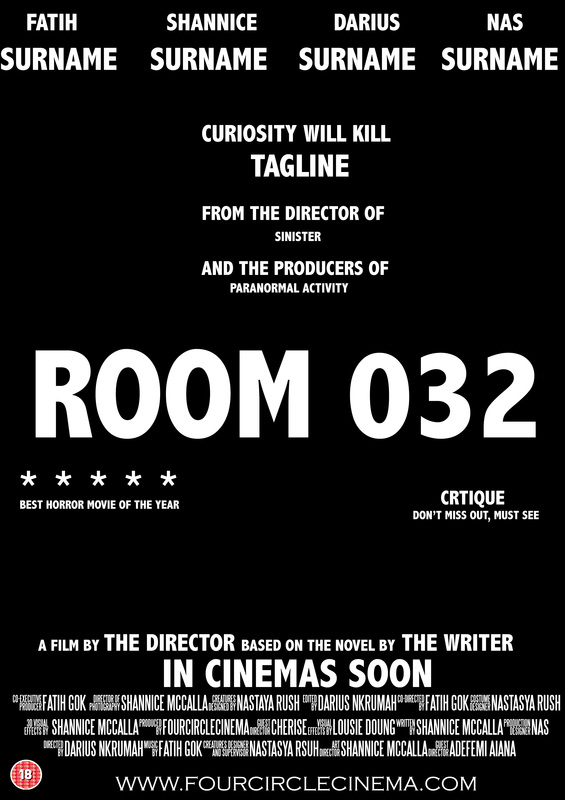
Draft 7: this draft is for our poster draft for our movie 032. this draft follows all the main conventions from a horror movie poster, however, there is a limited space to add an image and play around with certain things for the poster, on this poster there is too much text. The layout it simple and consistent which works very well.
Magazine Drafts
|
|