how effective is the combination of your main product and ancillary texts?
This is our EVALUATION QUESTION 2 on this page, you'll get the chance to see our film, Room 032, presented across many different media platforms in order to demonstrate the combination of our main product and ancillary texts. You will also learn how we would brand our film.
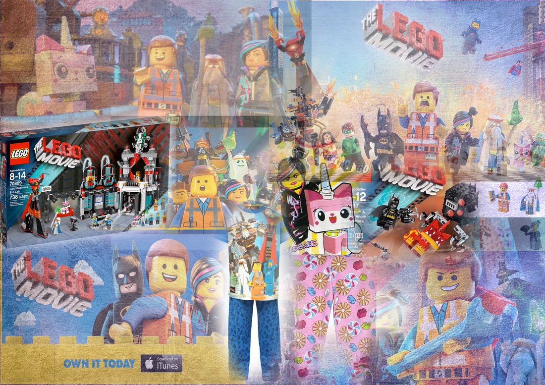
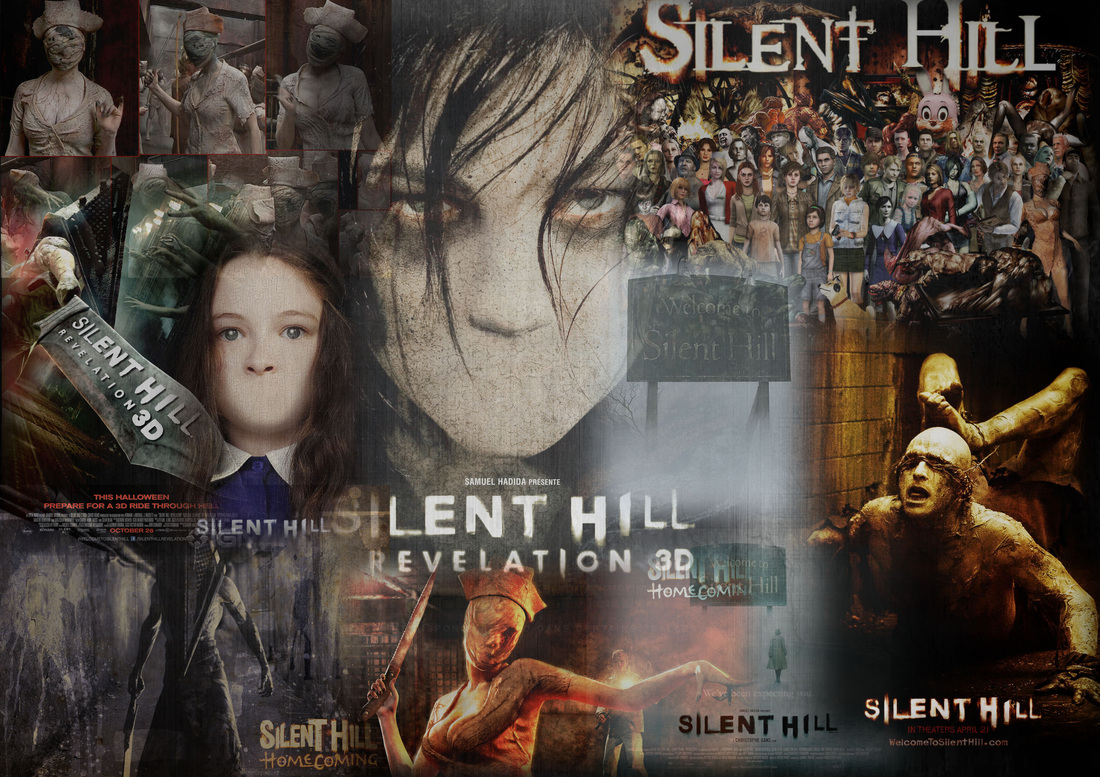
Strong branding is important for films and especially horror films as it will help the film become a franchise. on this page we will see if Room 032 has a strong enough brand to become a franchise.
Strong branding is important for films and especially horror films as it will help the film become a franchise. on this page we will see if Room 032 has a strong enough brand to become a franchise.
example of strong branding:
|
|
Example of synergy and Ideas of media convergence
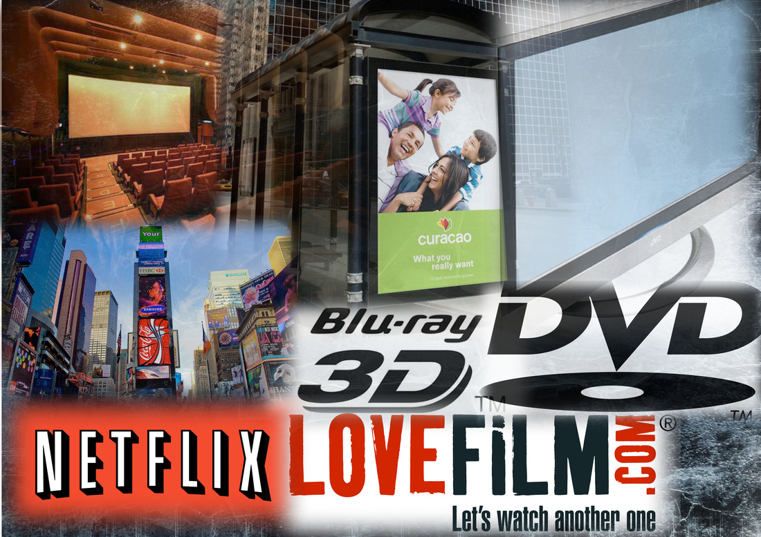
For a film to become a success it has to appeal to an audience and gain there attention. This is done by marketing the film through as many different media platforms as possible. Many horror films that become franchises become so successful because the have a large budget for marketing to reach out to all audience which will result in a success in the box office. Some ways you can reach an audience:
Success of other real media
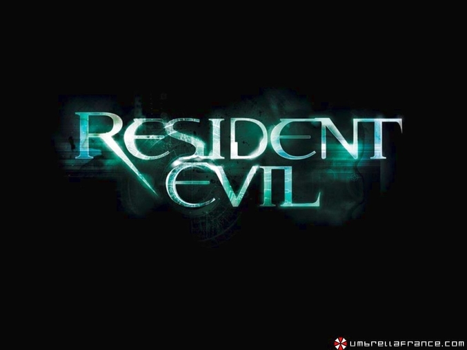
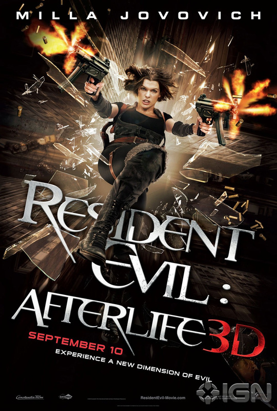
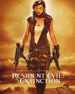
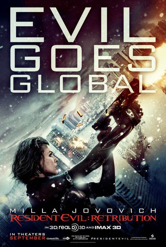
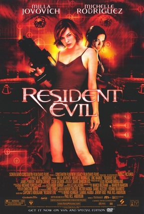
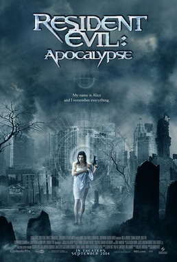
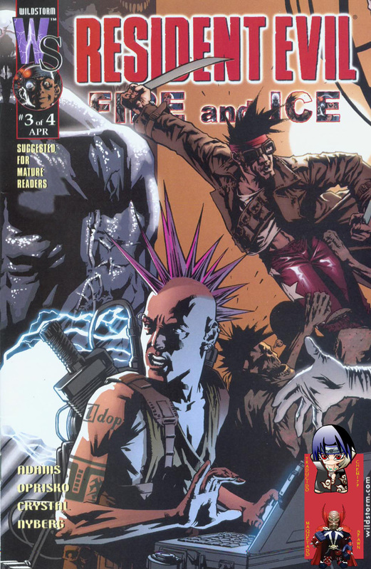
Resident evil is a very successful franchise with 6 films: Resident evil, Resident evil: apocalypse, Resident evil: extinction, Resident evil: afterlife, Resident evil: retribution and the last film Resident evil: the last chapter. The film is based on Capcom video game. All the films roughly made $244,443,938 in total. There are about twenty-one games, seven are the main games and the rest are spin offs. The franchise is about 18 years old. As you can see the main link in all the films is the character Alice who is the branding for the films her short dark hair and black attire represents the resident evil franchise which makes it easy for the audience to notice what film it is.
The films and posters
|
|
|
1) Resident Evil 2002
4) Resident Evil 4: Afterlife
5) Resident Evil 5: Retribution
|
2) Resident Evil 2: Apocalypse 2004
3) Resident Evil 3: Extinction 2007.
6) Resident Evil 6 Armageddon
|
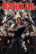
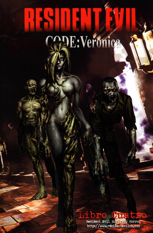
The video games
|
The first resident evil game was made for the play station it was released in Japan 1996 as a survival horror video game due to its popularity it was later re-released in to Nintendo ds and Microsoft another media platform. This was so well received it led to the spin off and the films.
|
|
|
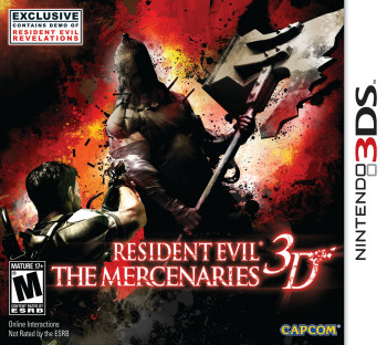
The most recent Resident evil games like The mercenaries is so modern it is in 3d on Nintendo ds which shows how it has changed and improved to keep up with the new technology of today's world. It also means that it keeps appealing to younger and newer audiences who weren't aware of it in 1996.
|
|
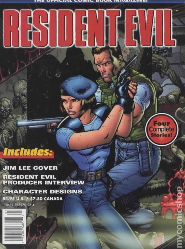
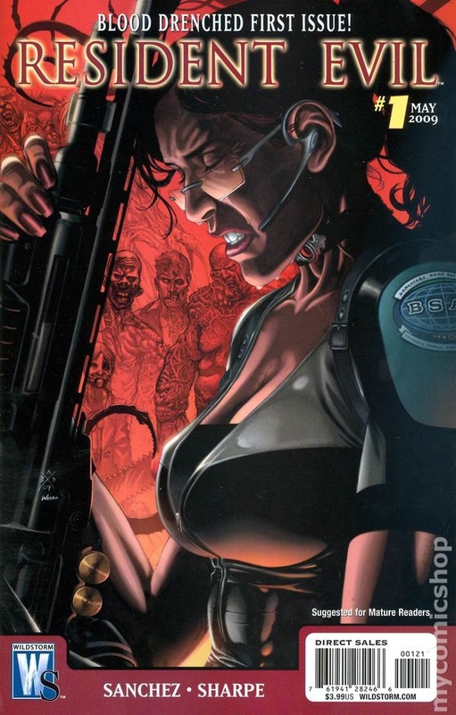
The resident Evil comics
|
|
|
|
Due to the popularity and strong brand they were then able to create comics again another media platform used to gain and bigger audience which also helped make it in to a franchise. This were also very popular meaning loads of spin offs created.
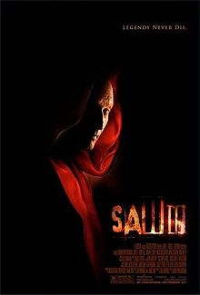
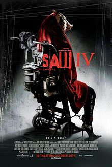
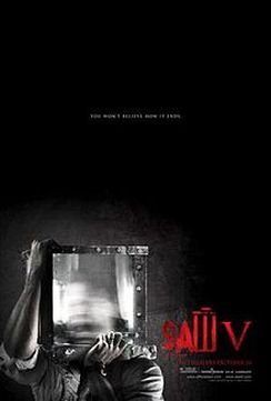
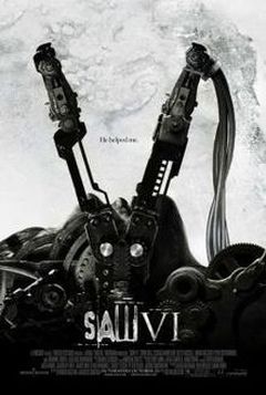
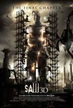
Saw is one of the biggest horror film franchise. It its such a big franchise with such a strong brand that it now has a roller coaster, haunted maze, 8 films (including a short film and a 3d one), comics and video games.
|
|
|
|
|
|
|
|
|
|
|
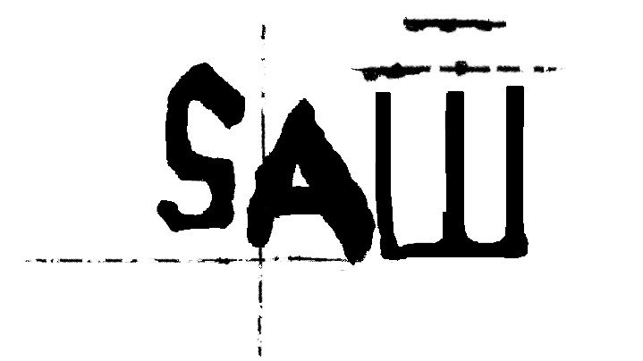
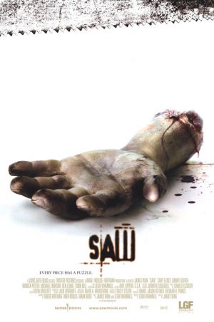
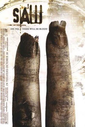
All film posters have the same front used for the title 'saw' however it is in different color's or texture to match the style of the poster. The way the title looks is a branding as it is easy to notice they are all connected and part of the same franchise but the different style of the title also highlights that it is a different film. Some of the posters also use body parts or torturing equipment to look like the number of the film for example the 2 film poster is two fingers to highlight that it is the 2nd film out of the franchise.
|
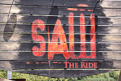
Thorpe Park has many 3 saw related rides in the park: Saw the ride, Saw Game over and Saw alive. The all use the same Saw title which again is strong branding as everyone will know the rides relates to the film and will be scary.
|
|
|
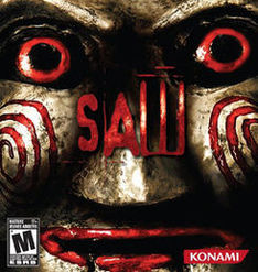
Again because of the popularity of the films two video games were created they are survival horror games. The first Saw game was created by zombie studios and was released in 2004. It was made for the X-box 360, PlayStation 3 and Microsoft which are three different media platforms again reaching out to a wider range of audience.
|
|
|
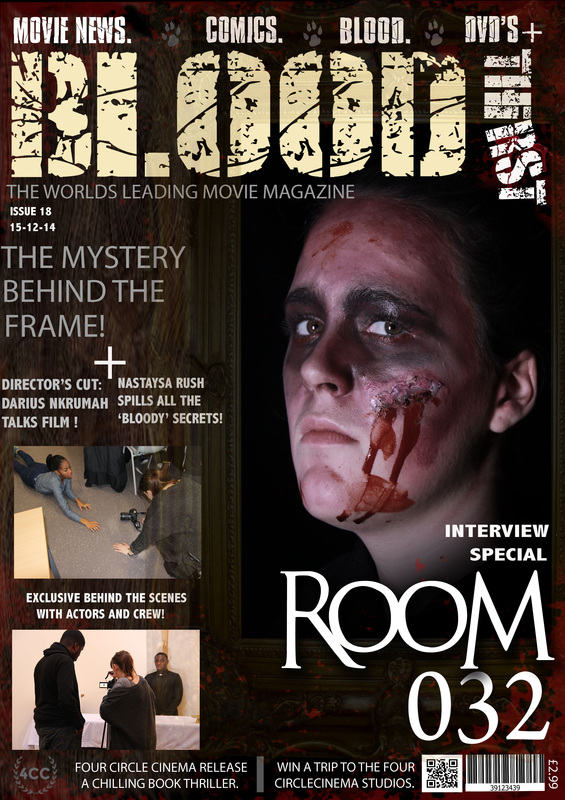
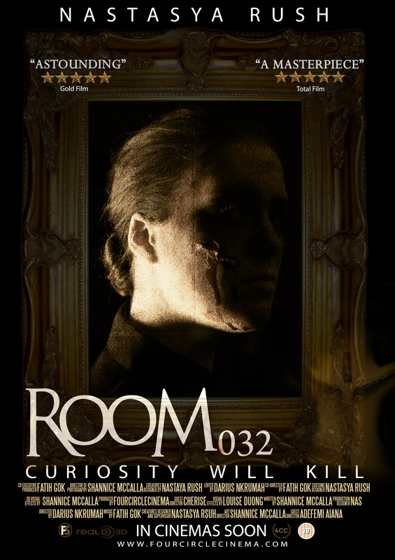
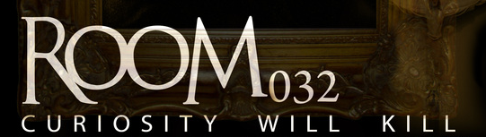
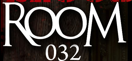
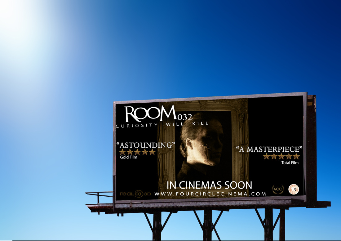
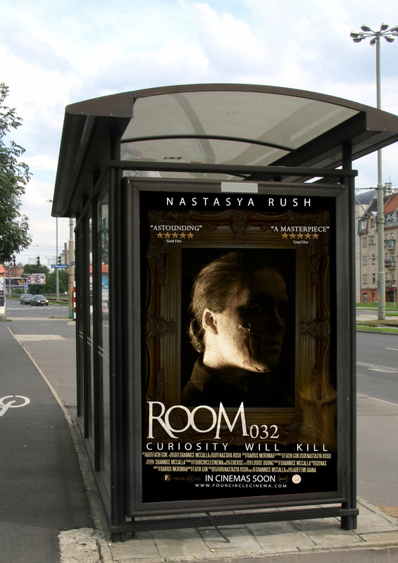
The colour scheme on magazine and poster is a yellow, black and white this is because the antagonist is an old portrait from the Victorian era. It also makes it look professional as it shows the clear link between the poster and magazine and indicates the old theme and style.
|
|
The title of the film on both the poster, magazine. The text used was An Unfortunate event on the film title along with the 032 being a lot smaller then the word room this is to make sure it easily noticed as the same film. The same text that is simple also makes it look sleek and professional. This was both used on the magazine and poster to show style and continuity.
|
|
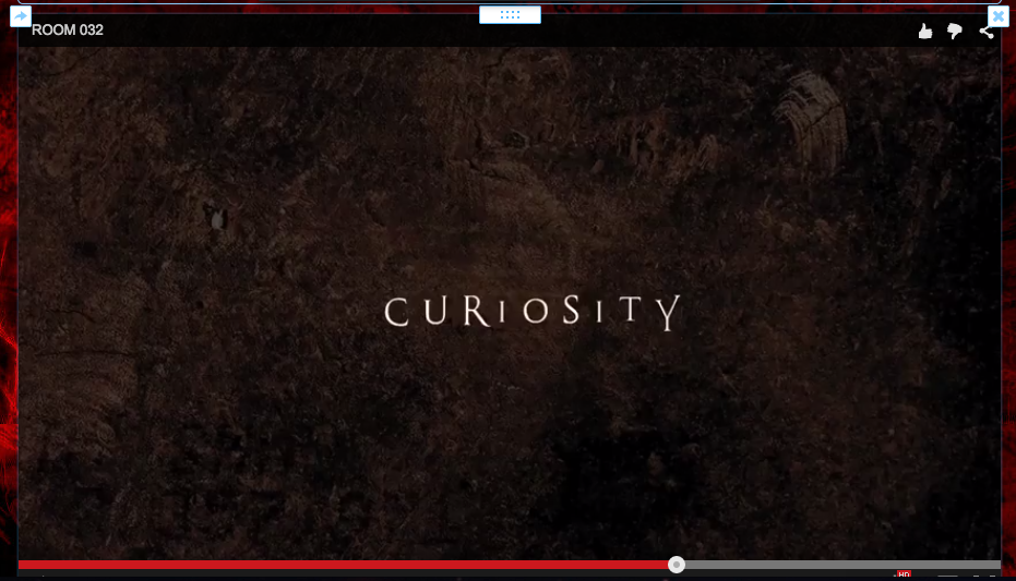
Trailer and poster
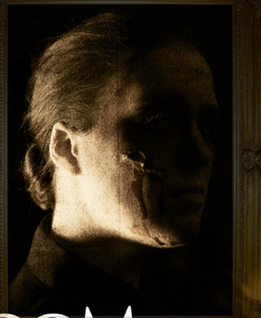
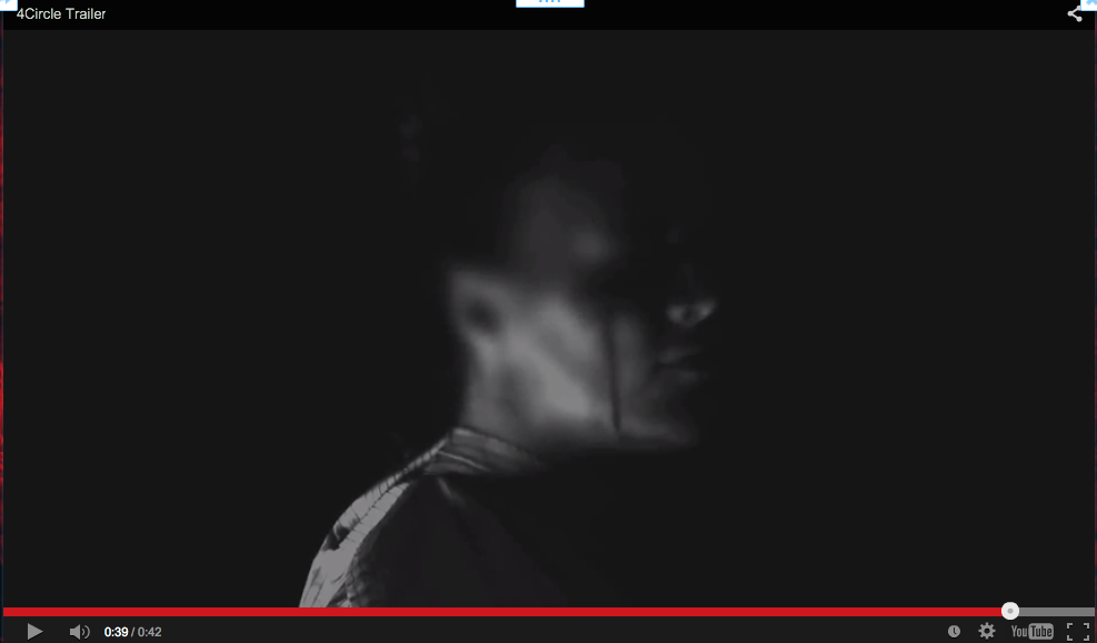
We also used the same shot/image of a side profile where the face is not noticeable. This makes people know that this is the antagonist but it adds a bit of mystery to the antagonist. This also makes it look professional because in films that are supernatural you don't really see the antagonist because its about building suspense and mystery which i believe the trailer and poster does as it teases at the antagonist.
|
|
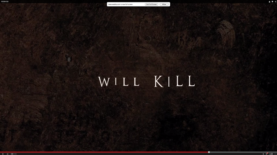
Another thing we did for continuity was the tagline it was both on the poster and trailer again using the same colour this makes it clear that it is the tagline for this film and gives a bit of a insight to what the movie is about.
|
|

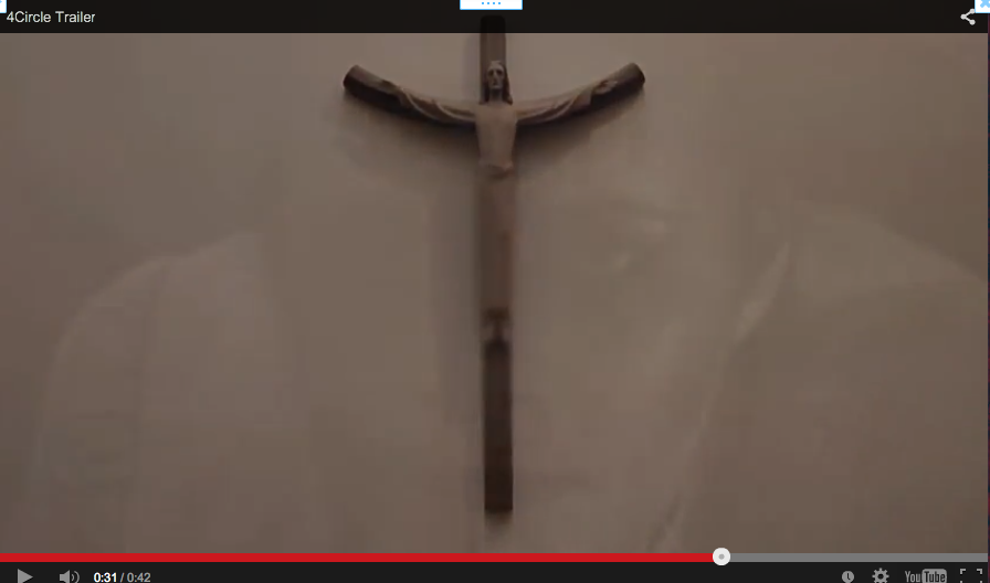
Another thing used in the poster and trailer to have continuity is the use of a cross which is also symbolic for the supernatural genre therefore continuing the religious idea.
|
|
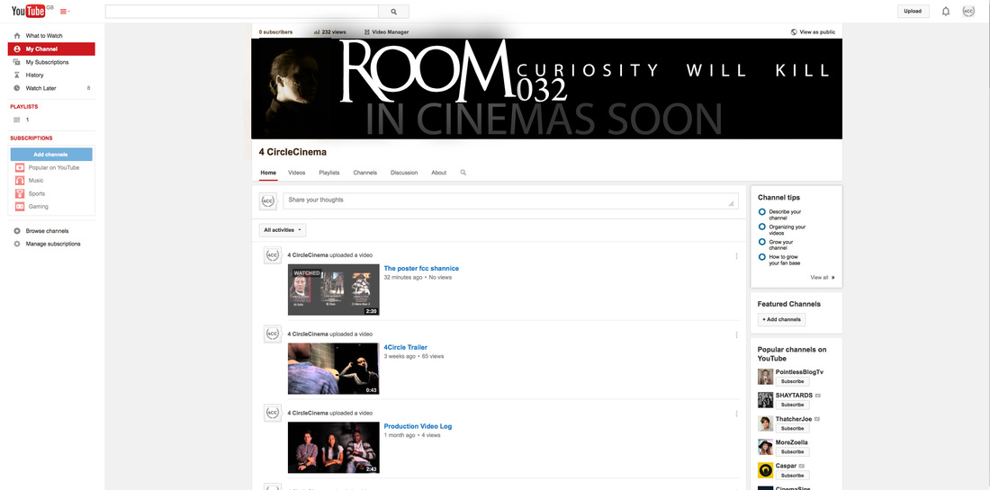
Adverting room 032 using different media platforms
|
|
Overall I believe Our film has a strong enough branding to advertise on different media platforms along with our trailer, poster and magazine have a over arching themes to create a style and achieve continuity.
