in what ways does your media production use, develop or challenge forms & conventions of real media text?
Conventions:
Conventions are what we see as normal and standard things in the horror genre, some conventions are a must if not the movie may not even be classed as a horror movie; it's crucial to follow the conventions as that will make up any horror product.
|
|
|
Sub Genre:
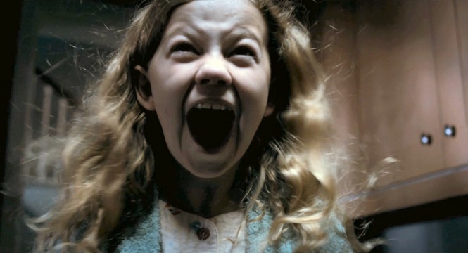
Our sub genre is supernatural however, it also carries some aspects of psychological. The reason for this would be because we followed conventions from both mainly focusing on supernatural, the parts in our trailer where we have our antagonist appearing is part of the psychological sub genre as we usually see little girls appearing and it looks like it has been caught on camera. It was important we followed these conventions of our sub genre so we could class it as the sub genre we have chosen to go for. The whole idea of the frame represents the supernatural parts of our film, this is main because of the plot of the frame and how it's a demon and has a worshiper that teaches young girls; this part was key as it's one of the biggest conventions in horror. However, we did add some subversion and made our antagonist also a female character.
|
|
|
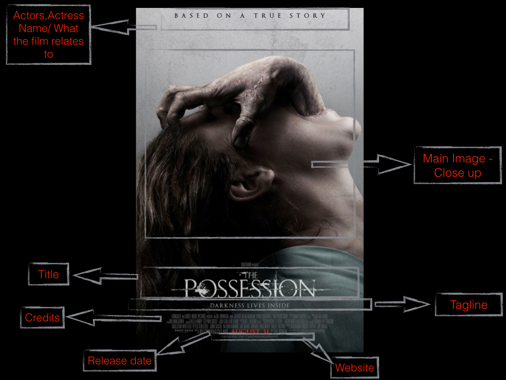
Film poster:
|
Poster Mise-en-scene:
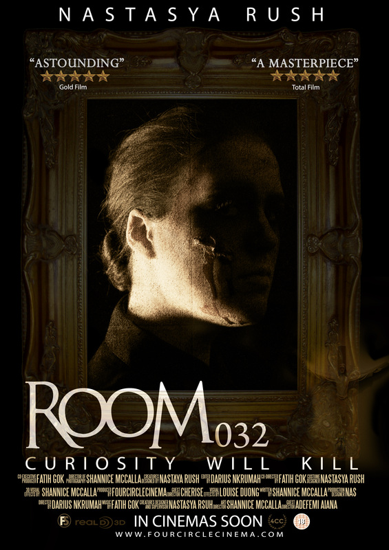
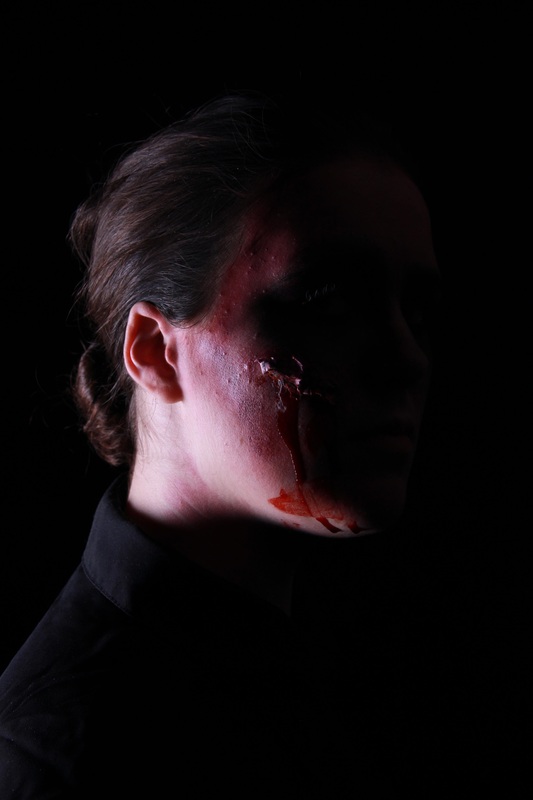
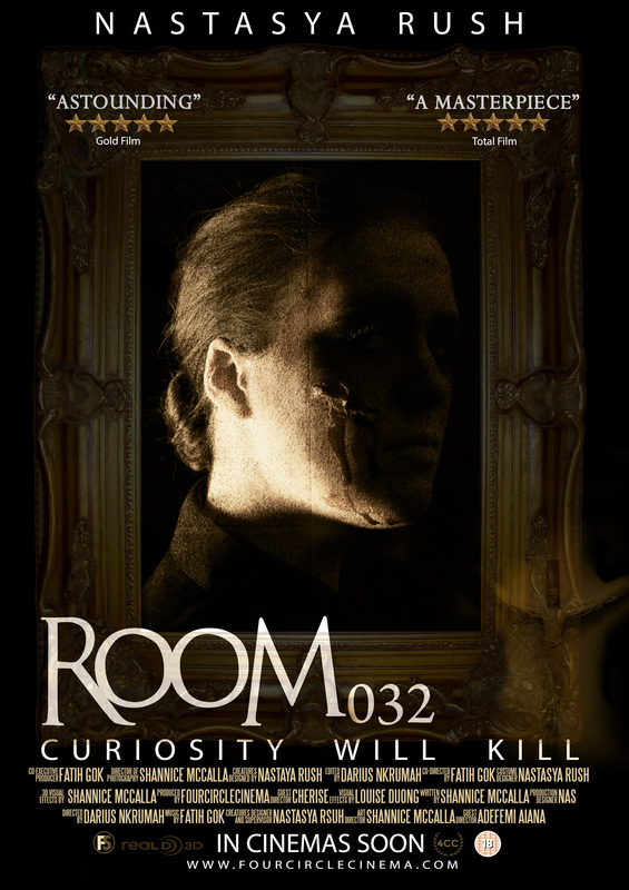
Lighting: The lighting in the poster is dark, the main reason for this is not to reveal too much of the antagonist, this keeps our antagonist in power which is very a important convention in the horror genre. Overall, the whole poster infact is very dark, the only burst of colour is the frame in the poster, this is important that it's bright as it plays a very big role in the film, the frame is also like the antagonist, which balances the idea of not showing the antagonist but also showing her in an object form. NVC: We see a limited amount of facial expressions because of the lighting used, however, when you look closely you'll see the antagonist staring at you. The antagonist has a very proud which shows her confidence and it gives the hint of how cold hearted she is, this is important as we're trying to making the character as scary as possible to suit the horror genre. The NVC doesn't give away too much about the character personality and builds tension for the viewers of the film, the main thing we see from the characters NVC is that she has a very dark character which something expected in a horror movie. We also have a subversion with the antagonist, because a main convention in the horror genre is that the antagonist is usually a male character after girls, in our movie it's a woman who is the antagonist; however, we can argue that in most supernatural horror film the spiritual characters are usually females. Costume: We don't really see a costume in the poster we only see that the antagonist is wearing a a black blazer. however, there were props used such as the frame and the cross in the bottom right hand corner. Setting: There isn't a setting in the poster, if there was to be a setting it would be inside the frame. This is the transformation of the original picture, we added filters and effects to the image so it looks more like a old portrait,; therefore, it would relate to the concept of our film. This image worked very well with the poster because the model is positioned very well and has a proud posture. We cropped out some of the image so it fits and looks more realistic.
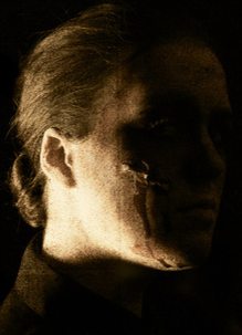
This was the type of effect we was going for (image on the left), even though this image is brighter it still has the type of colour we was going for. This colour seems to compliment the rest of the poster, especially the frame and text. |
Real media text:
|
|
|
These are the main posters we were inspired by, one main factor was the layout of most of them; we like the way they have positioned most elements such as the film titles and credits. This works very well because there is more space to edit and place the main image which was helped us especially as we needed space for our frame, this allowed the poster to look more neat and professional. We also kept the tagline at the bottom of the poster under the title, this also seemed like a convention. Another convention followed was having the release date, logo and the age certification at the bottom of the poster. A convention that we followed however, also challenged was the main image and the character, we have a female character which is the same as many horror film posters, and in most of them we don't see their faces as it's a convention to disempower the female identity in the horror genre. On the other hand, our character is the antagonist and usually it's the victim if it's a female character, this shows some subversion within our whole concept. The convention of not seeing the characters face has been followed very well because of the lighting as it blocks out most of her face. Another convention challenged was having the actors/actresses name on the top of the poster, on most of horror posters we don't really see this, we only see elements such as the other films created by the director or what the film is based on.
Film Poster conventions diagram:
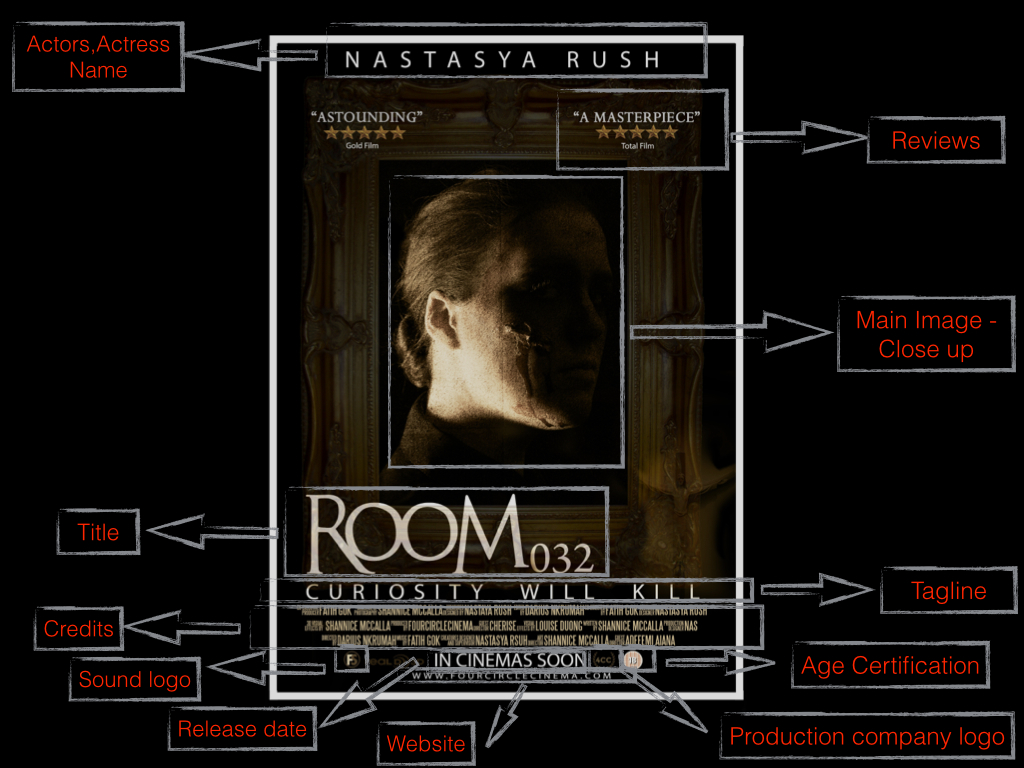
Room 032 poster conventions:
Colour

This was the colour scheme we went for, however, in this diagram you cant really see how it relates to the poster as the poster has more of a golden hue because on the frame.
Tagline
|
|
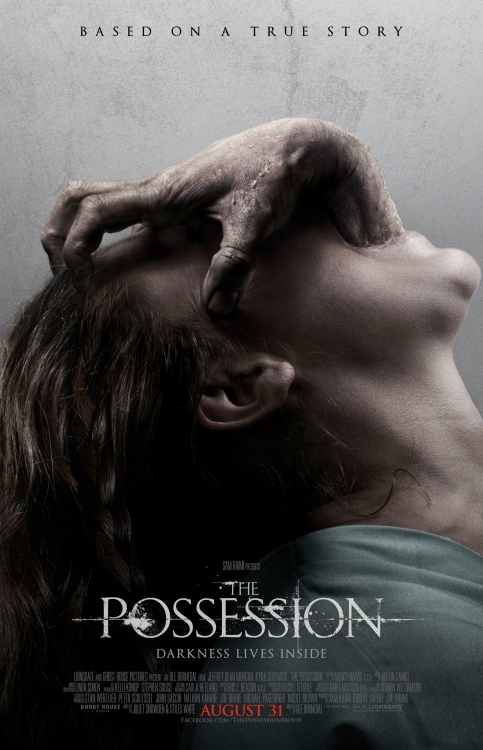
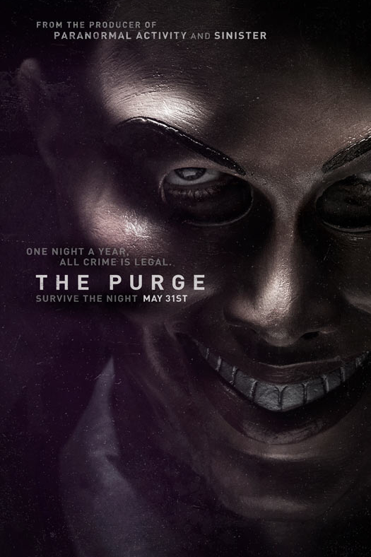
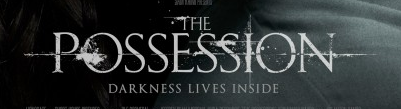
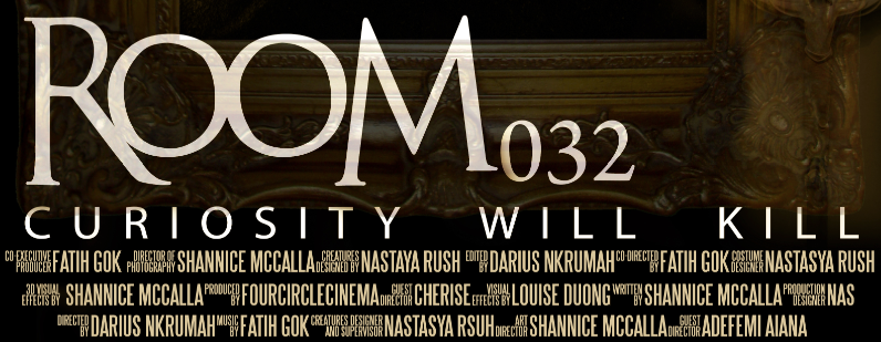
The tagline is a convention that has been followed from existing horror movie posters, for example 'The Possession' poster positioned the tagline underneath their title which has worked very well because it shows a flow and the tagline usually matches the title. For example, our movie is called Room 032; it sounds like a important room as it is the title this will make people want to know what the room is all about therefore, a suitable tagline like 'curiosity will kill' works very well. This also tells the audience a bit about the film which could make people want to watch the film more, this is why the poster is important because it determines the success of the movie.
Credits
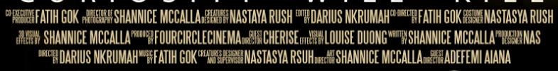
We created the credits on Photoshop using a the 'steel tongs' font, it has worked very well because it was something we followed from real media text, we followed this by having 3 lines in total for the credits and not having all 3 lines the same length. We also added colour to our credits and not kept it at a plain white, this was because it didn't look too good on the poster, we could argue that this was a convention that was challenged because in most horror movie posters and in most movie poster the credits are left white and very simple.
Website
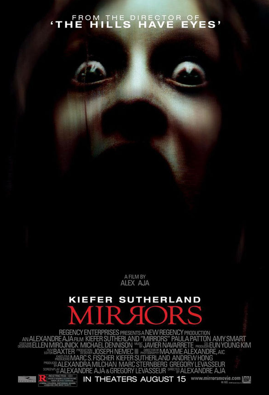
The way we positioned the website is a convention that has been followed because we placed it at the bottom of the poster and just underneath the release date, this is similar to the film poster 'The Possession'. 'The Possession' uses social media as a website, we have a independent website just for the film, this could be a convention that has been challenged.
Release Date

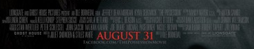
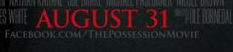
The way we positioned the release date is convention followed as we placed it under the credits similar to 'The Possession' film poster . However, they put in a an actual date instead of "In cinemas soon" this could be a convention challenged. Although, because it's a teaser trailer we decided to not tell the audience that it's in cinema, this would allow them to keep track for the main trailer which would have the release date; this will help us keep a close and good audience.
title
|
|
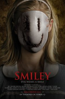
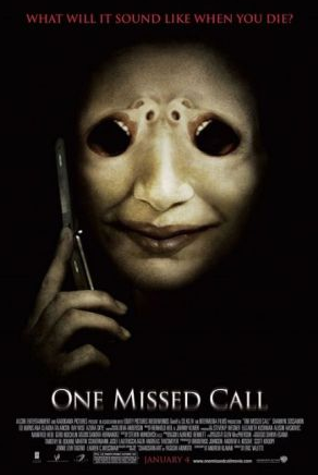
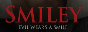
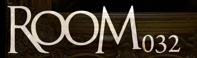
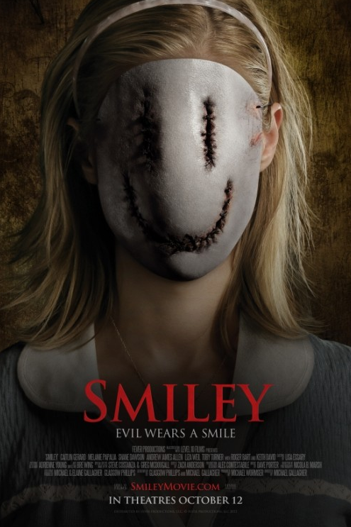
The positioning of the title is a convention that has been followed from real media text such as the film poser 'Smiley', they have positioned their title at the bottom of the poster which has worked very well as it has left plenty of space to place the image and any other relevant text on the upper section of the poster. A convention that has been challenged is the sizing of the title for example the work "Room" is bigger that the numbers "032", however, other posters keep to one size. Another convention that has been challenged is the colour and how bold it is, we used the opacity tool which allowed us to see the frame through the text which has worked very because it shows a consistent flow, especially with the cross on the bottom right.
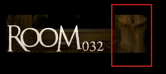
This small detail goes very well with the poster as it blends in with the frame, especially as it is not too sharp, this image was a shot from the chaplaincy and was also used in our trailer. These work very well together and bring out a good composition, this has also allowed the poster to not be plain and added an extra detail.

|
|
|
These are the two main real media texts that our posters relate to, mainly the layout of the poster; the main factor being the way we have positioned the typography. We have the same layout however, our poster has more detail and follows more conventions.
critiques |
|
|
|
This a convention followed from real media text, film reviews on the poster; this helps attract the audience by seeing what others think about the film, these are usually positive stuff which helps. The gold stars have helped the critiques look more realistic and helped fill up the upper section of the poster.
Logos

This was a convention followed by having all the logos such as the production company logo at the bottom of the poster under the credits, we also added the age certification as it is also seen as convention on horror movie posters.
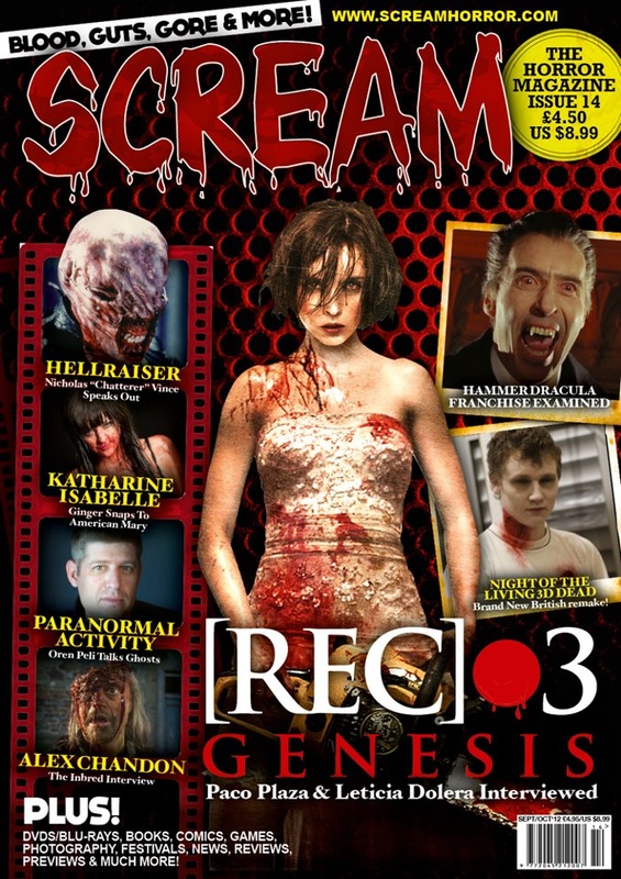
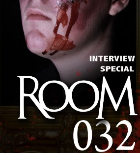
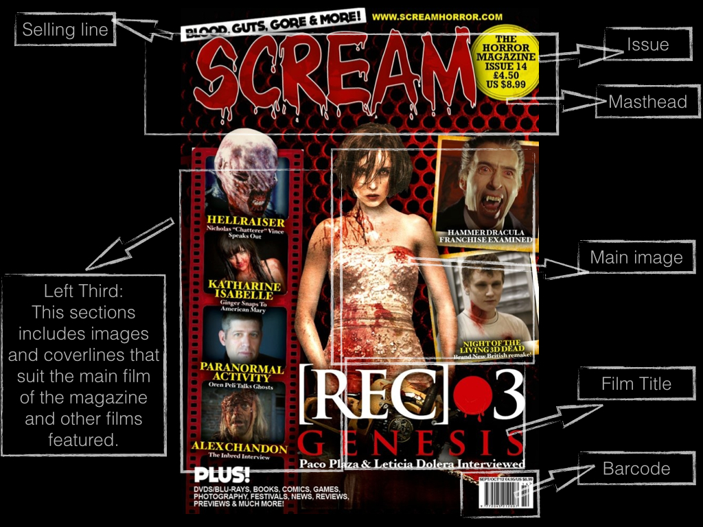
Horror Magazine: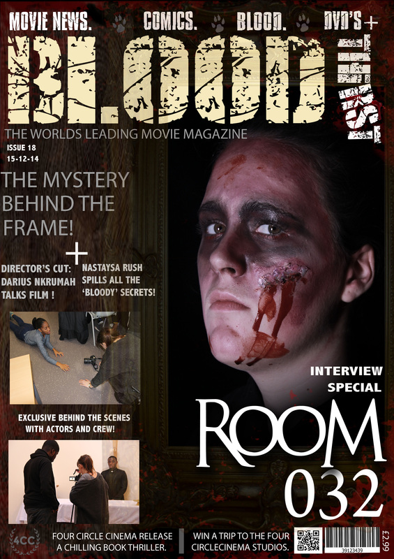
real media text |

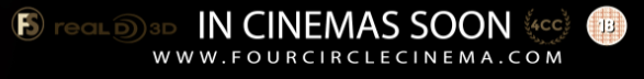
These logos were also conventions that have been followed by having it at the bottom of the poster under the credits. These logos represent the sound and that the film is also available in 3D, this shows a variety of ways to view the movie.
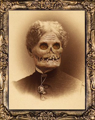
Mise-en-scene: Lighting: The lighting on the main image is dark, this is because it's a part of the poster and it compliments it. The images on the left third are images from behind the scenes from the film Room 032, these images are brighter to show the making of the film. Overall, the whole magazine cover has a good balance of lighting due to the having the frame, main image and smaller images all in different tones and opacity, this shows a consistent flow within the magazine cover. NVC: The NVC on the main image is very serious, this shows that everything is still relating to the film. The model has played two role in the movie, the image tries to show both by having the frame but not too much of the demon we can still tell it's Mrs Tresex. The images on the left third show that the group was hard at work and everyone was focused during the making of the film. Costume: We don't see any of the main image character costume as it blends in with the lighting, this shows that we don't want to give away too much from the movie and still keep the antagonist as a complete mystery, this is important because we don't see much of her in the trailer, so we didn't want to give away too much away in the magazine because we don't in our other 2 products. Setting: The setting of the magazine is in college, but we don't see that in the main image, however, we do see it slightly on the left third images. |
|
|
|
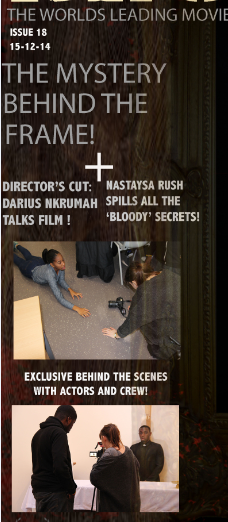
The real media text helped us create our horror magazine as we kept referring back to it. We analysed the magazines during the drafting stage but we still kept looking back the real magazines; this helped us with the layout of our magazine because we was having difficulties, we followed most of the conventions of the layout and the elements that need to be added such as the issue, barcode and date.
Main image

|
|
The main image is a convention that has been followed from a real magazine. We followed the convention of having the main image on the left section of the magazine cover which has worked very well because we had more space for the frame that represents the film and we also had space for the left third. A convention that we challenged was having a female character instead of male as a main image, this shows there is some subversion in our product.
Masthead
|
|
The masthead is convention that has been followed by placing it on top of the magazine cover, another convention that has been followed is the sizing this is because the masthead takes up most of the space on the upper section of the magazine cover. A convention that has been challenged is the way we have the word 'Thirst', also we didn't use any gradients on our masthead we only used solid pastel colours.
Left Third
|
|
The left third was convention that we have challenged, this was mainly the film strip section that we didn't follow. The main reason for this was because it didn't compliment the magazines style and it didn't blend in well, another factor is that it was hard to place the frame with the left third because it took up some space; the frame is a crucial element because it represents the film and the main character on the main image. Instead of the film strip we added a wood effect which worked very well with the colour scheme of the magazine cover. The images were kept at a minimal and are at a good size for the left third. Another convention challenge is not have the barcode on the left third, this was once again because of the difficulties of spacing.
Film Title
|
|
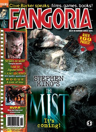
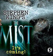
The film title was a convention that has been followed, this is because of the positioning of the text. On real horror magazines they also have it over the main image which works very well because it doesn't take up space, this important as a magazine has many elements on its cover that need space to place. A convention that we could argue that has been challenged is not showing the tagline of the film similar to the 'The Mist' having "It's Coming!".
Price, QR Code & barcode
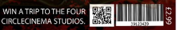
The price, QR code and the barcode are conventions we followed and added into our magazine cover, most of the real media text we've been referring to doesn't have a QR code this could be because they're more older and not current magazines. The way we have challenged this convention is by placing all three elements together and not having them separate like the scream magazine, this made the magazine cover look more organised and it has shown a consistent flow with the layout.
|

|
Horror Magazine Conventions Diagram:
trailer
Real media text
|
|
|
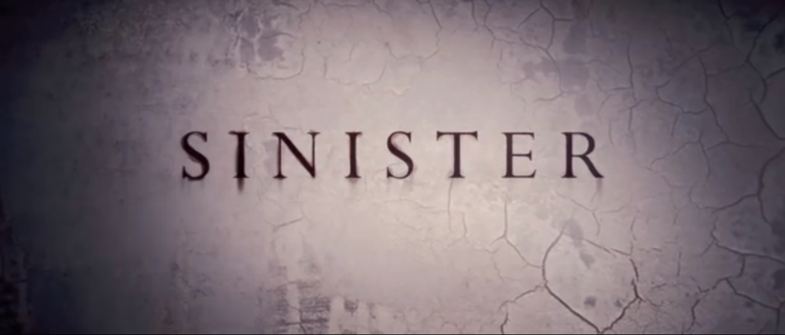
These are the real media texts (trailers) we kept referring to, the main inspiration was sinister however, we still have some aspects from other trailers. The main elements we followed and challenged was the shots, captions, sound and effects; these elements have also helped us understand conventions of a horror trailer better and what works better for the trailer, by following these conventions we had a good structure for the trailer.
A convention followed was the opening of the trailer, they included their production company with a background that relates back to the actual trailer, we followed this convention by also have a dark background and have our production company at the opening of the trailer.
|
Image from the opening of the Sinister trailer.
|
Conventions (shots)
|
|
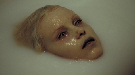
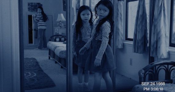
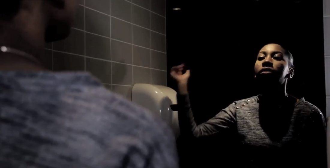
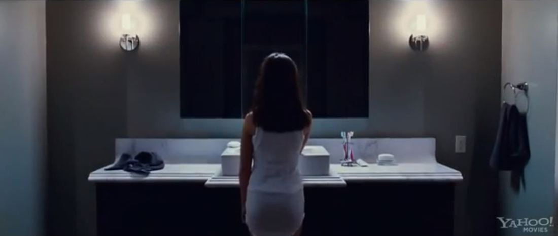
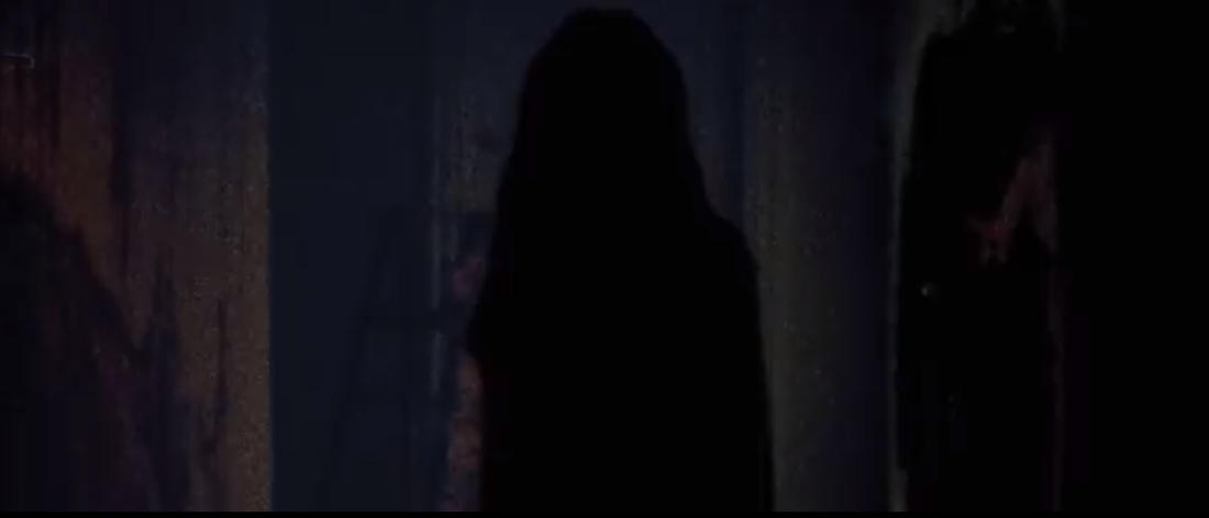
This is a convention followed by the trailer 'The Possession', the main convention is having a mirror and a female character behind it; this builds tension because they audience are waiting for something to pop out or something horror related to happen. In the sinister trailer this doesn't happen however, we have challenged this convention by showing our antagonist in the mirror, this added a really good effect on the trailer and we believed it had worked very well because it relates to the sub genre.
|
|
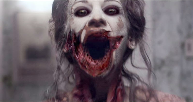
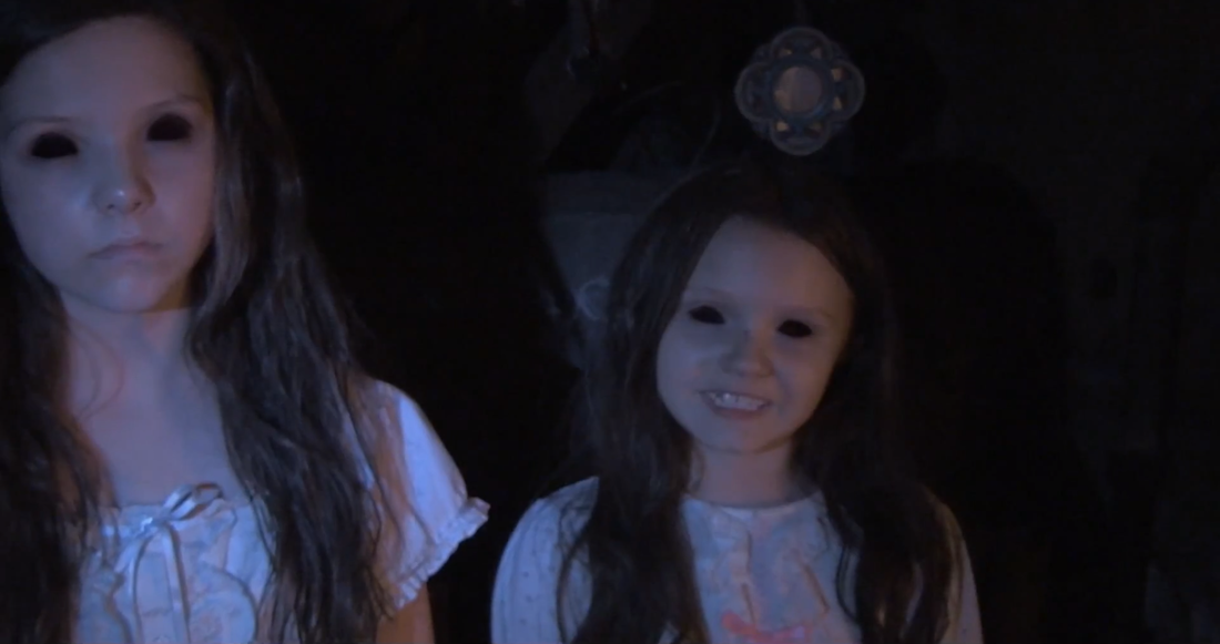
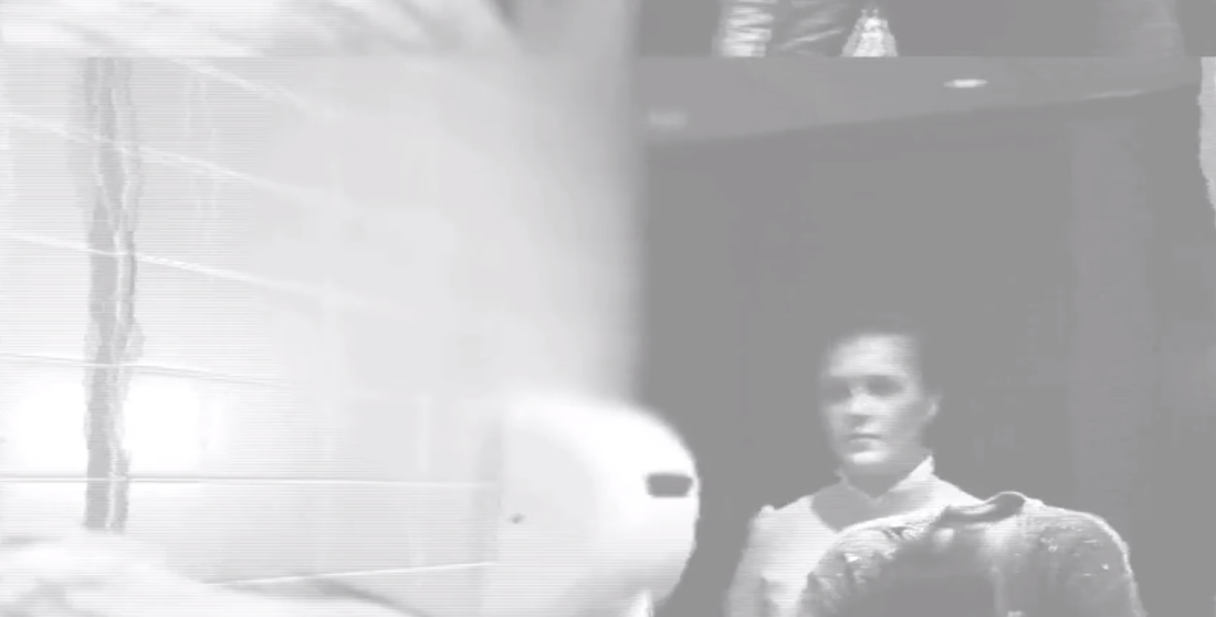
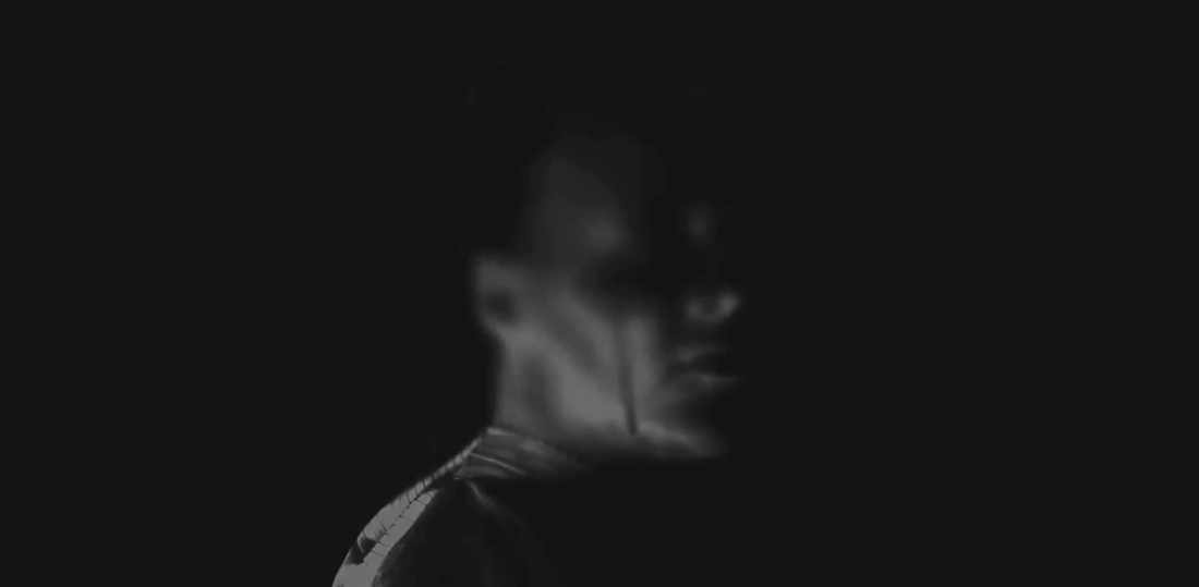
This was a convention followed towards the end of the trailer, the main idea here is to show the film title then straight after having the antagonist appear, we followed this convention in many ways. Firstly, we both show female antagonists in the final shot, another convention is that the antagonist's face is covered with an effect this shows that we're not giving too much away from the film which also builds tension for the audience. This is a good shot to have at the end because it's unexpected which is uncomfortable for the viewer which helps us with the horror genre. However, the only thing that we challenged is the way the antagonist appears, for example in sinister the antagonist just pops out and goes away within a second, however, our antagonist comes in with a slight fade and moves her head, throughout the shot we still don't see the antagonist.
SOUND IN THE TRAILER
|
Steel and seething was the sound track that we used throughout the whole of the trailer, this worked very well because it created a very uneasy and uncomfortable feeling which relates to the sub genre.
We also used some thuds for the captions, dropping of the missing board and when we see our antagonist, this worked very well because it created a slight 'jumpy' feel to the audience. | ||||
